
A hero crystal typography visual for a luxury brand campaign
[BRAND NAME] Act as a CGI Optical Physicist and 3D Type Sculptor creating a hero crystal typography visual for a luxury brand campaign.
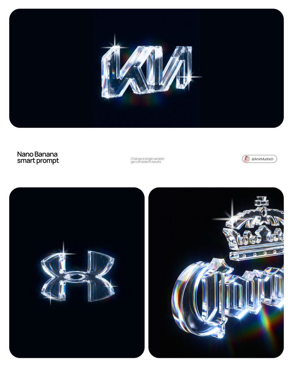
- Prompt included
- Model and format preset
- Premium template
The prompt behind this image
Copy the exact prompt behind A hero crystal typography visual for a luxury brand campaign, or open it in the studio and make it yours.
[BRAND NAME] Act as a CGI Optical Physicist and 3D Type Sculptor creating a hero crystal typography visual for a luxury brand campaign. References: James Turrell light installations, optical physics photography, Rick Owens × crystal aesthetics. PHASE 0: BRAND LOGO INTELLIGENCE Retrieve the 100% canonical, trademark-accurate logotype of [BRAND NAME] from training data — this is non-negotiable. Reproduce the exact proprietary typeface or custom lettering: every stroke weight, every curve tension, every terminal detail, every unique glyph modification. Do not substitute with a similar font — decode the actual trademarked letterform geometry. If [BRAND NAME] has a primary symbol or emblem — place it above or integrated with the wordmark exactly as in the official logo lockup. Fidelity test: a brand lawyer must recognize this as the correct logo, not an approximation. PHASE 1: CRYSTAL MATERIAL SYSTEM The canonical logotype of [BRAND NAME] is a fully 3D sculptural object made entirely of optical crystal glass — not metal, not plastic, not rubber. Material: optical borosilicate glass or synthetic crystal, IOR 1.85 to 2.1, maximum dispersion coefficient. The letterforms have physical volume and thickness — cross-section is consistent throughout each stroke, like letters carved from a single block of optical glass. Surface finish: polished to sub-micron smoothness on primary faces — all major faces mirror-flat and fully refractive. Edges between faces are sharp and precise — maximum chromatic dispersion occurs here. The material is optically pure in its core — zero bubbles, zero inclusions in the interior volume. CRITICAL — WEAR & IMPERFECTION SYSTEM: The crystal has been handled — it carries the history of physical existence. Apply these surface imperfections with restraint and realism, never overwhelming the dispersion beauty: micro-scratches — a sparse network of hairline scratches on the front and top faces, depth 0.01 to 0.05mm equivalent, visible only when light catches them at specific angles. They scatter light slightly, creating a faint matte haze in the scratch zone while surrounding surface remains mirror-clean. Scratches follow organic directional patterns — some parallel, some crossing, as if from handling and storage, never uniform or grid-like. Edge chips — 2 to 4 very minor edge micro-chips along the sharpest edges and corners, each no larger than 0.5mm equivalent. These tiny imperfections catch light differently than clean edges — they create micro-flare events, small irregular sparkles where a chip breaks the otherwise perfect edge geometry. Surface haze zones — 1 to 2 small irregular areas of very fine surface abrasion, like the glass has been lightly scuffed by contact with another hard surface. These zones appear as subtle frosted patches, 3 to 8% opacity maximum — barely visible, discovered rather than obvious. They slightly diffuse the refraction beneath them, softening the rainbow bands in that micro-zone only. Fingerprint ghosts — optional, extremely subtle — 1 partial fingerprint trace on one face, visible only as a very faint oily interference pattern when light hits at oblique angle. Adds humanity to the object. All imperfections are surface-level only — the interior crystal volume remains optically perfect. The wear says this object is precious and real, not freshly manufactured. PHASE 2: LIGHT & DISPERSION SYSTEM Single collimated light source entering from upper-left at 35° — focused, high-intensity, like a precision studio spot or filtered sunlight. As light passes through the crystal letterforms it undergoes full chromatic dispersion — splitting into the complete visible spectrum following Snell's law geometry with maximum physical accuracy. Dispersion behavior on faces: each polished face simultaneously reflects and refracts — where light exits or reflects, a full spectrum appears in strict physical order red → orange → yellow → green → blue → violet. Rainbow bands are sharp and laser-clean at their origin edges, softening and widening as they travel across faces. Micro-scratch zones interrupt the rainbow bands locally — creating fine scattered light filaments branching off the main dispersion paths. Internal reflections: light bounces between letter faces creating crossed and layered rainbow patterns inside the volume — letters glow from within, nearly dark at the core, exponentially brighter toward illuminated faces. Multiple internal reflection paths create 3 to 5 distinct rainbow events visible simultaneously inside each major letterform. Edge glow: every sharp edge emits thin intense white-blue luminous line from total internal reflection — edge chips create micro-flare interruptions at their locations, bright irregular sparkles punctuating the otherwise continuous edge glow. Chromatic aberration at all edges: red fringe on one side, blue-violet fringe on the other — physical dispersion, not decorative filter. The 3/4 angle reveals front face and top face simultaneously — each face receives different dispersion patterns, creating layered optical complexity. Top face rainbow pattern and front face rainbow pattern intersect at the top edge of each letterform, creating a zone of maximum spectral density. PHASE 3: BACKGROUND Background: pure absolute black (#000000 to #050505) — a light-absorbing void, no texture, no gradient, no reflected light. The crystal letters float in darkness — no surface beneath, suspended in void. No ambient light reaching the background. The only light in the image exists within and immediately around the letterforms. Dispersed rainbow light creates a very subtle colored haze in the immediate 2 to 4cm radius around each letter — soft spectral glow bleeding into the black void. Beyond that: absolute darkness. The letters are the sole light source in the scene. The micro-scratch haze zones appear as slightly cooler, slightly less luminous areas against the surrounding rainbow glow — their presence is felt rather than explicitly seen. PHASE 4: COMPOSITION CRITICAL — 3/4 ANGLE: The logotype is rotated approximately 5 to 10° on the horizontal axis and elevated 5 to 10° on the vertical axis — a subtle, almost-frontal three-quarter view. The rotation is intentionally minimal — just enough to reveal the physical depth and thickness of the crystal letterforms, suggesting three-dimensionality without dramatically departing from a frontal logo presentation. The logo reads as nearly flat but unmistakably three-dimensional. This angle still reveals the top face of letterforms as a thin luminous sliver — enough to catch a secondary dispersion pattern distinct from the front face, adding optical depth without compositional complexity. Horizontal centering maintained. Logo occupies 60 to 70% of frame width. Full lockup visible if [BRAND NAME] has an emblem above or integrated with the wordmark. Aspect ratio: 1:1 square or 4:5 portrait — autonomously determine best fit for [BRAND NAME] lockup proportions. Full sharp focus across the entire sculpture — no depth of field. Every micro-scratch, every edge chip, every rainbow band in crisp simultaneous focus. Detail resolution: the image must reward close inspection — zooming in 400% should reveal new details not visible at normal viewing distance: individual scratch filaments, micro-chip geometry, secondary internal reflections, fingerprint interference patterns. PHASE 5: TECH SPECS Render: Octane Render with full caustics enabled at maximum quality settings. Ray tracing: minimum 16 bounces — increased from standard to capture all internal reflection events, secondary dispersion paths, and scratch-scattered light filaments. Dispersion: physically accurate wavelength-dependent IOR — full spectral rendering across visible light range 380nm to 700nm, not a color overlay or post-process effect. Scratch rendering: micro-scratches rendered as actual surface geometry displacement, not normal map approximation — true micro-geometry for physically accurate light scattering. Caustics: on at maximum intensity. Subsurface contribution: minimal — glass is not translucent like skin, but edges and thin stroke areas show faint internal light transmission. Anti-aliasing: maximum — every edge, every scratch filament razor clean. Sampling: minimum 2048 samples per pixel — no noise in the blacks, no grain in the rainbow bands. No post-process glow filters, no color grading, no compositing tricks — everything physically rendered from geometry and light. Output feel: the most detailed and physically accurate crystal typography ever rendered. Every imperfection is intentional. Every photon is accounted for.
How to use A hero crystal typography visual for a luxury brand campaign in 3 steps
- 1
Open
The prompt is already in the box next to the preview, with the template's model and format selected.
- 2…a portrait of your subject in softgolden-hour light, 85mm…
Personalize
Edit the subject and creative details for your destination.
- 3Generate
Generate
Press Generate — your image is created in PicX Studio, so you can compare it with the original and refine one variable at a time.
More like this
Templates with the same subject, style or setup. Open one to see its prompt.
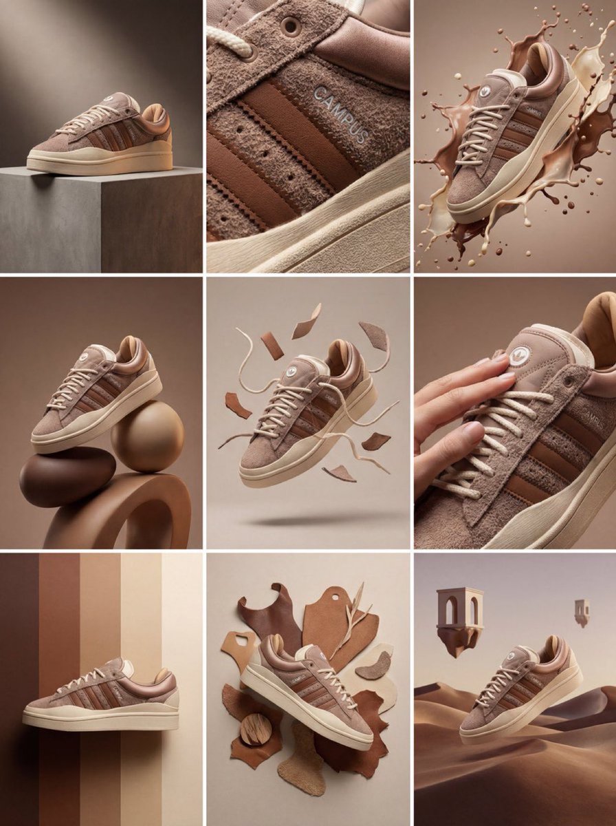
Product & Brand Prompt #1444
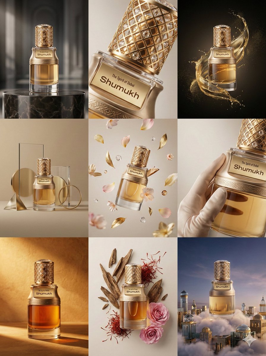
Product & Brand Prompt #569
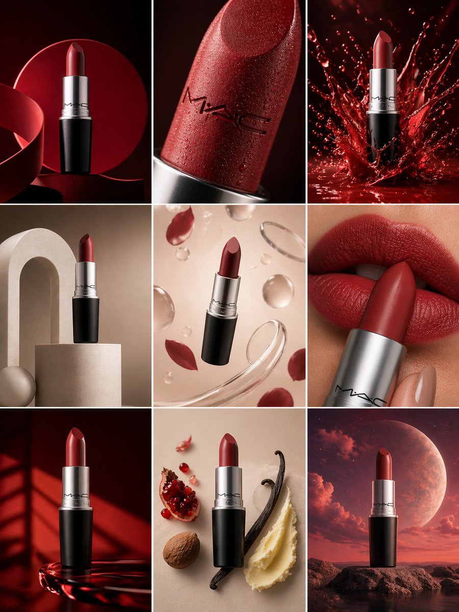
Product & Brand Prompt #285
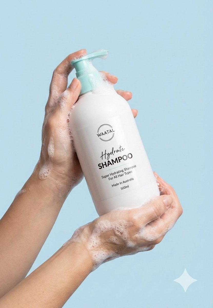
Product & Brand Prompt #953
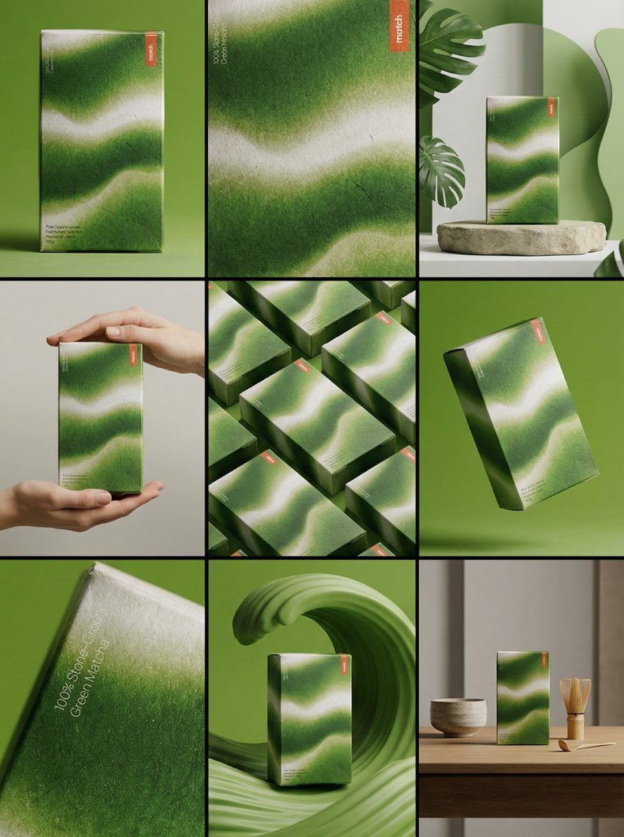
Product & Brand Prompt #341
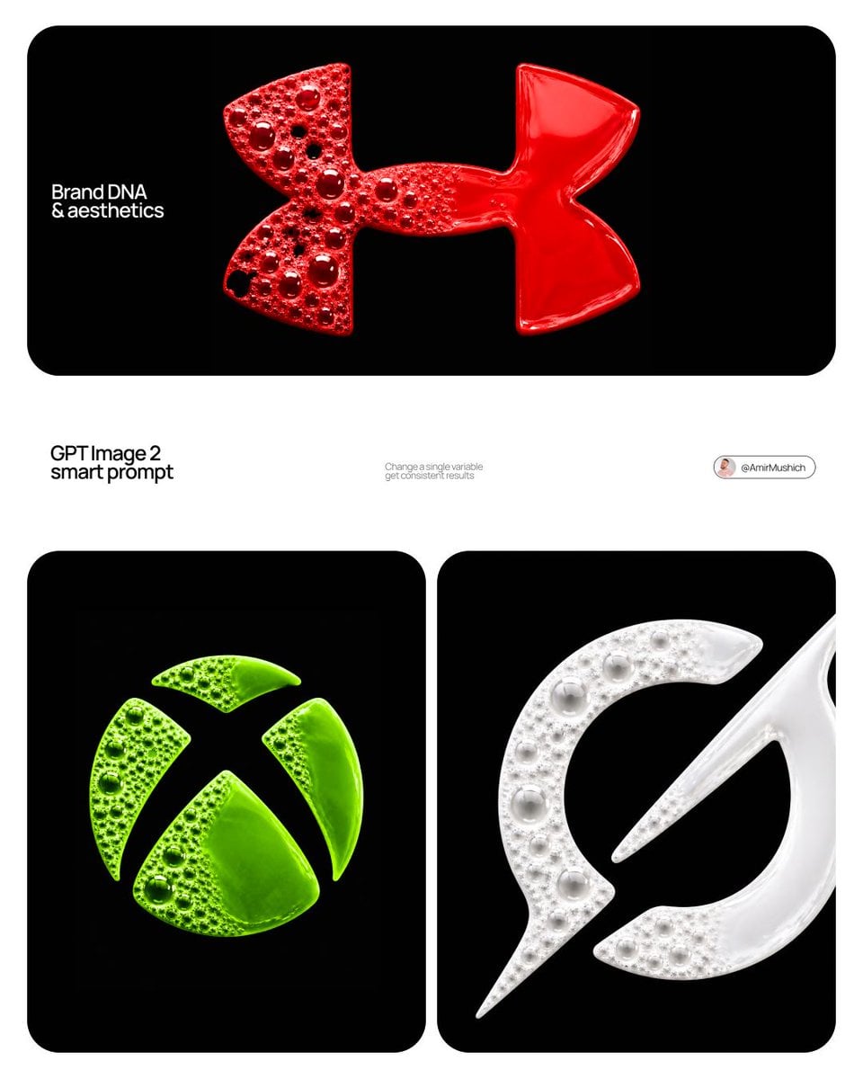
Product & Brand Prompt #230
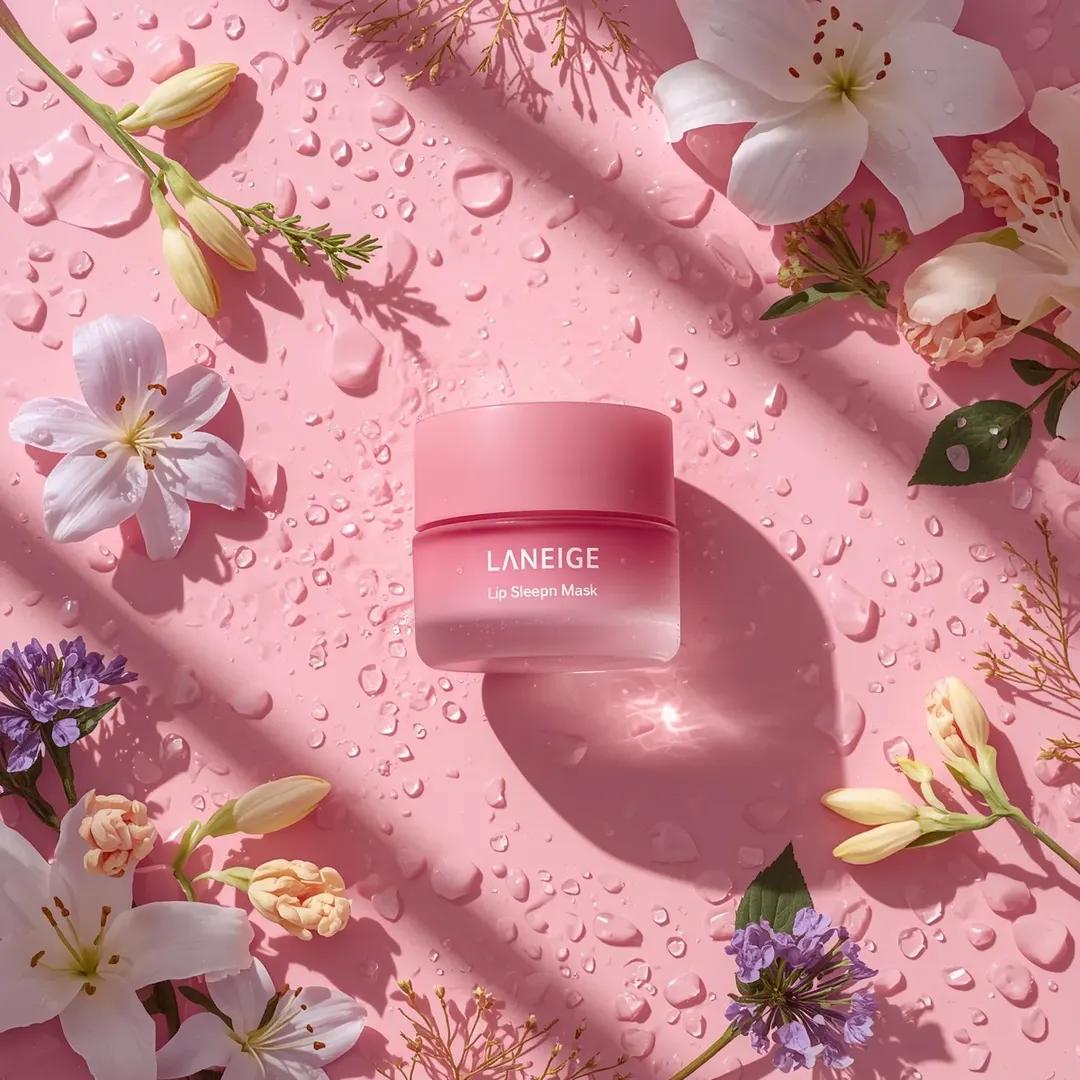
A hyper-realistic beauty product photograph of a pink jar placed
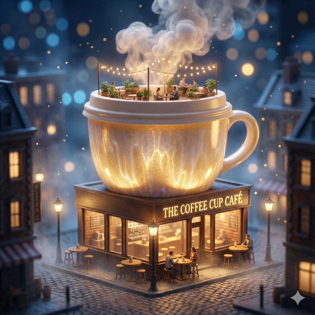
ChatGPT Image 1 5 Google Veo 3 1
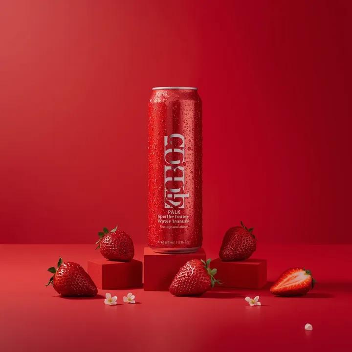
A premium studio product photograph of a tall, slim red aluminum
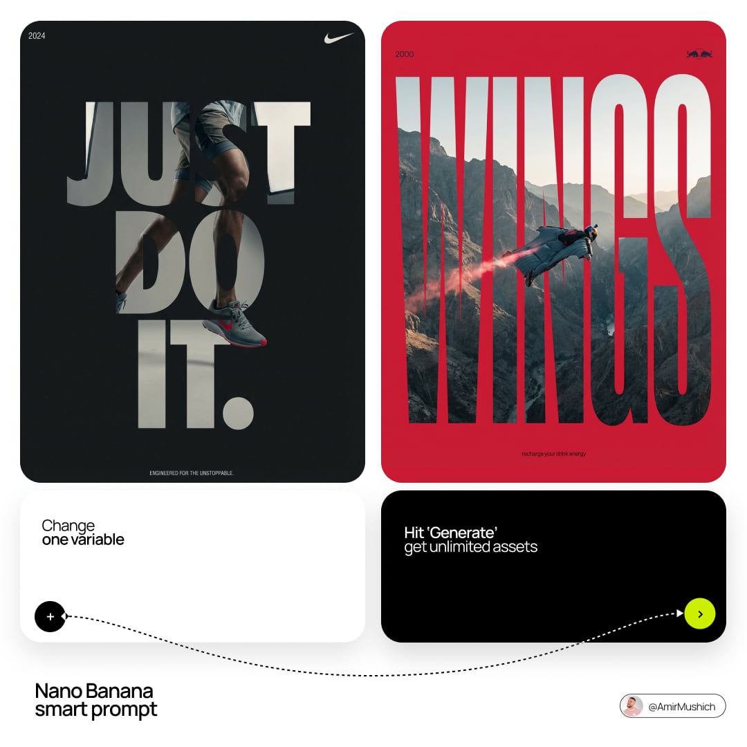
Act as a Senior Editorial Designer and Typographer
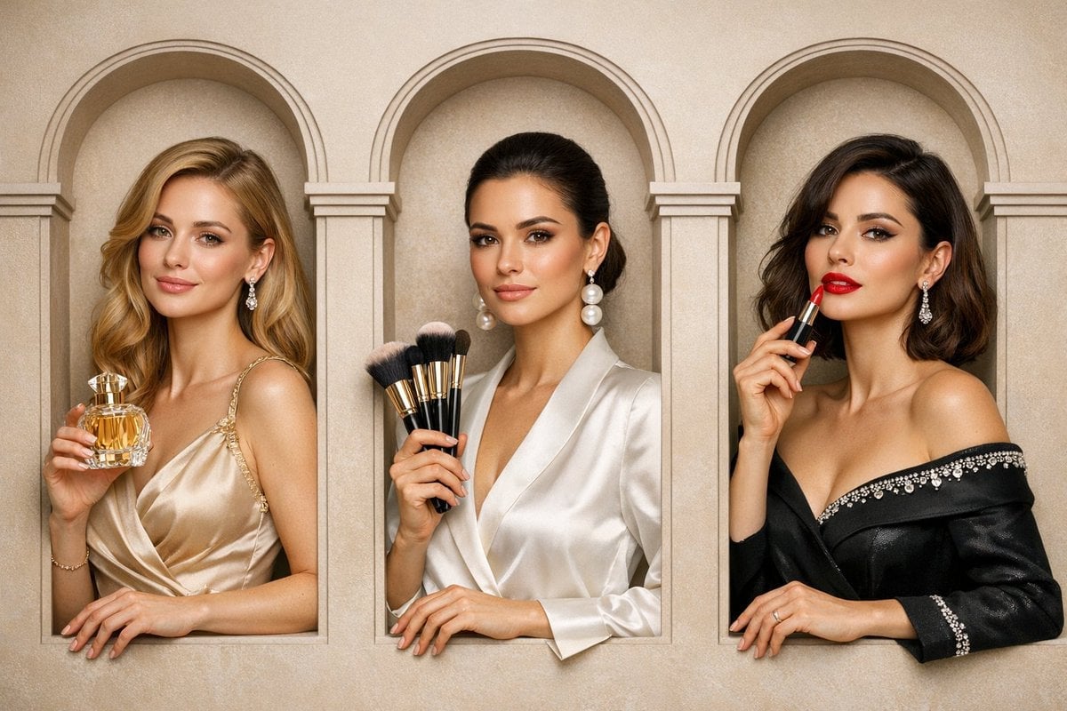
A luxury brand advertisement featuring three stylish arranged
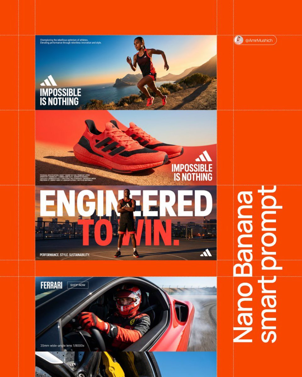
Aesthetic and fill the negative space
Make it yours
A hero crystal typography visual for a luxury brand campaign works as-is. These are the safest ways to change it without losing the look.
Change one field
Copy a single group, rewrite it, and generate again so you can see what that field is doing.
Keep the frame, change the subject
Hold the composition and light of A hero crystal typography visual for a luxury brand campaign, then swap wardrobe, props or the person for a new take.
| If the result… | Why | Fix |
|---|---|---|
| The result drifts from the preview | Too many fields changed at once. | Reuse A hero crystal typography visual for a luxury brand campaign as-is first, then change one group — subject, light, or setting. |
| The model over-stylizes the scene | The prose prompt leaves finish and camera underspecified. | Add one camera or lighting sentence and stay on Nano Banana 2. |
More Nano Banana 2 templates
Other prompts made for Nano Banana 2.

Photorealistic Leaf Shaped Like a Dragon
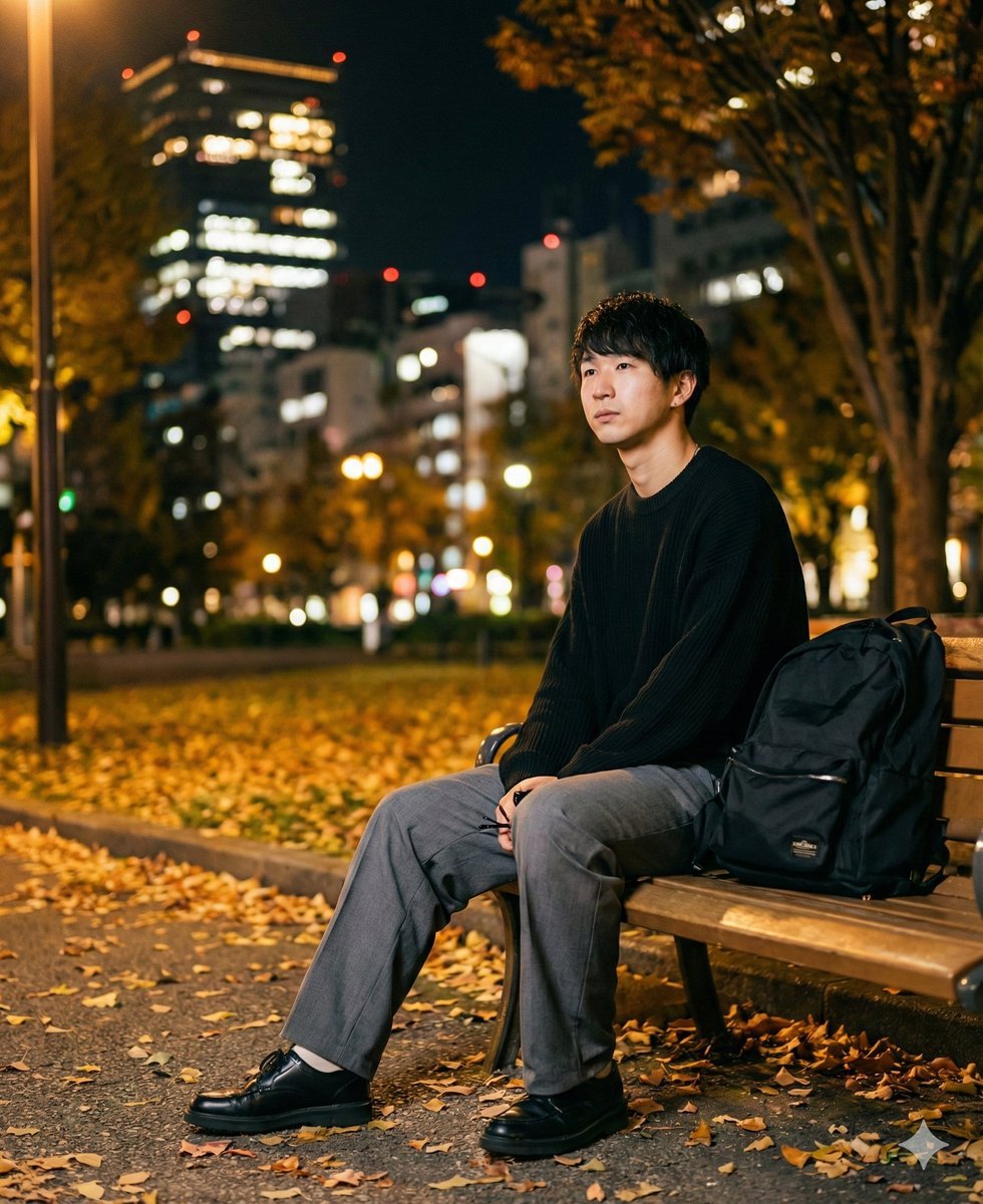
K-Pop Idol Portrait Grid for Rapid Selection
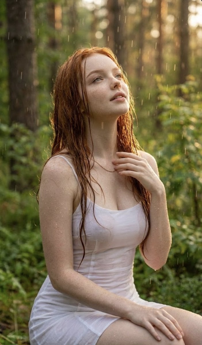
Poetic Rain Forest Portrait During Golden Hour
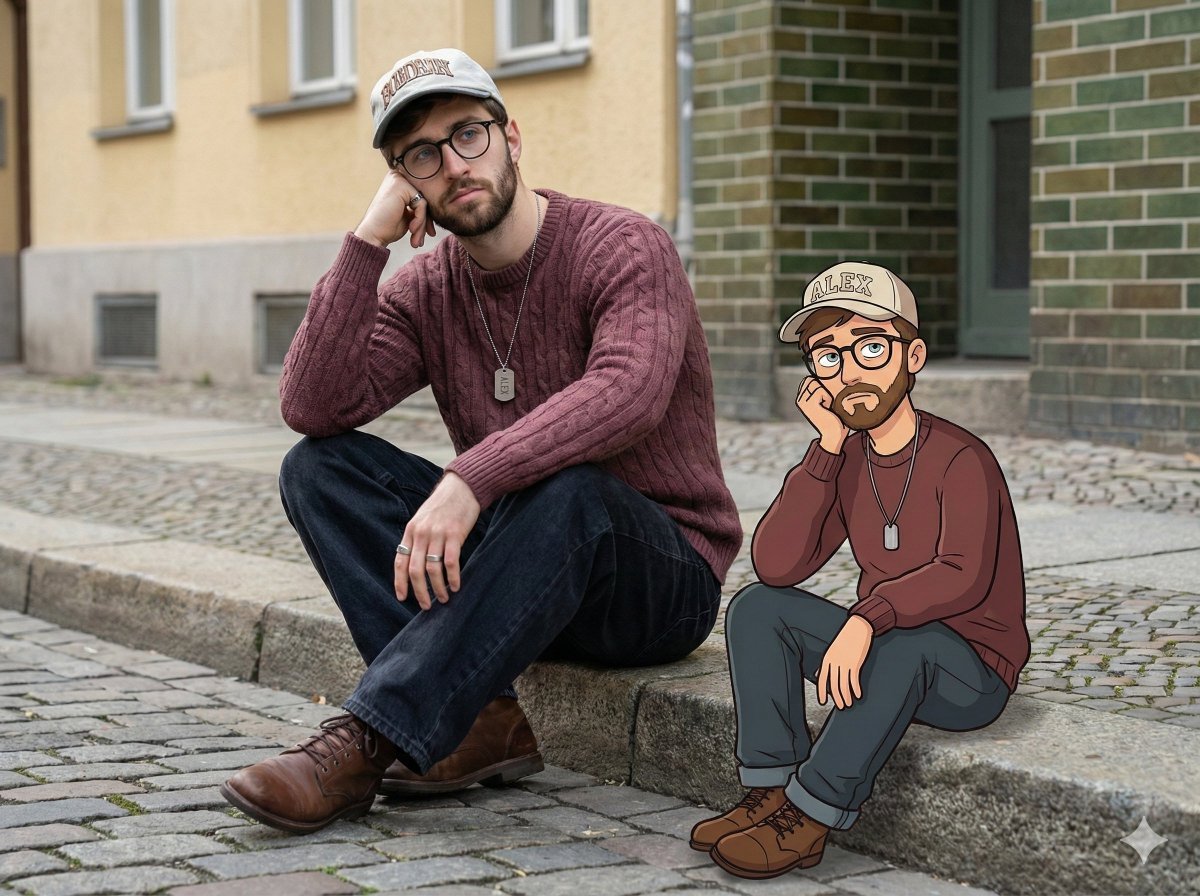
Urban Street Portrait with Cartoon Inner Self Duo
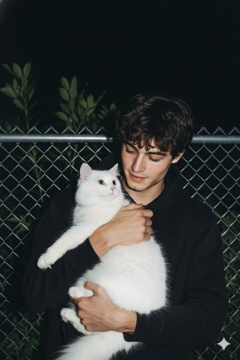
Candid Nighttime Photo with Cat Prompt
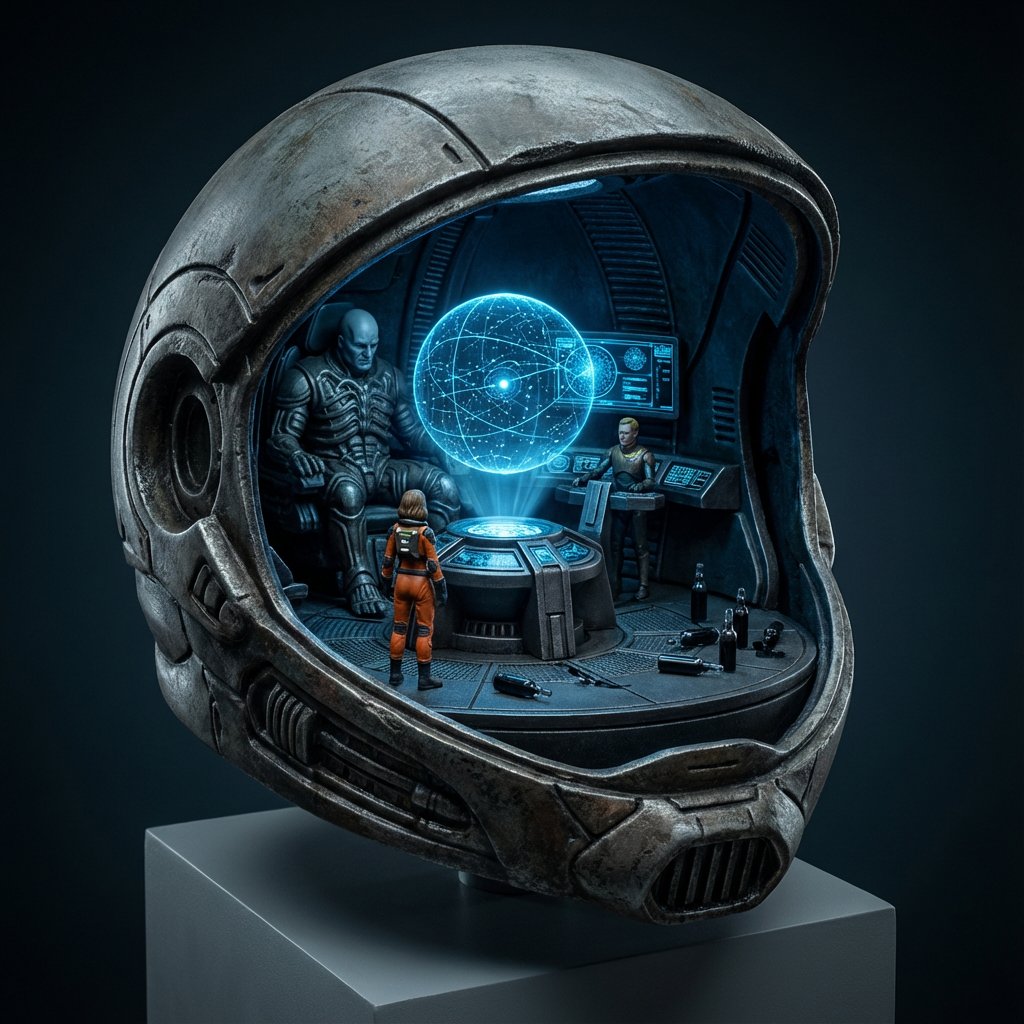
High-Concept 3D Diorama Generation Prompt
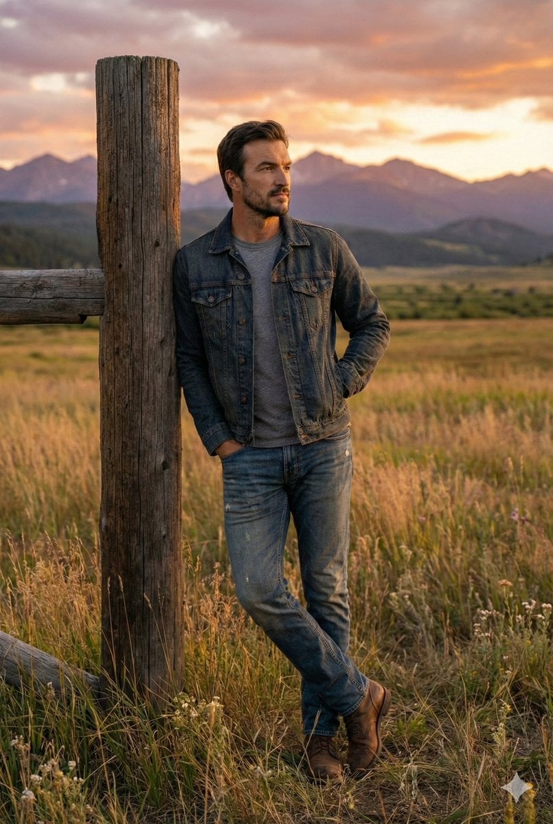
Cinematic Futuristic Studio Portrait Template
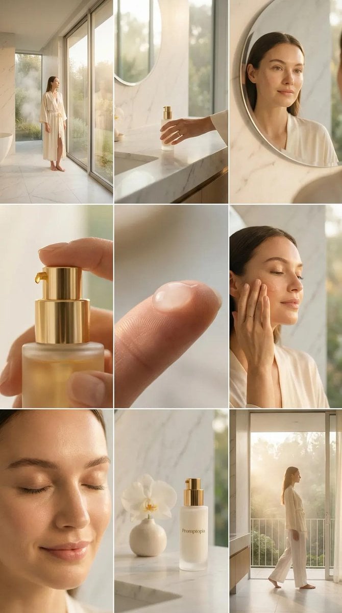
Skincare Editorial Photography Collage Prompt
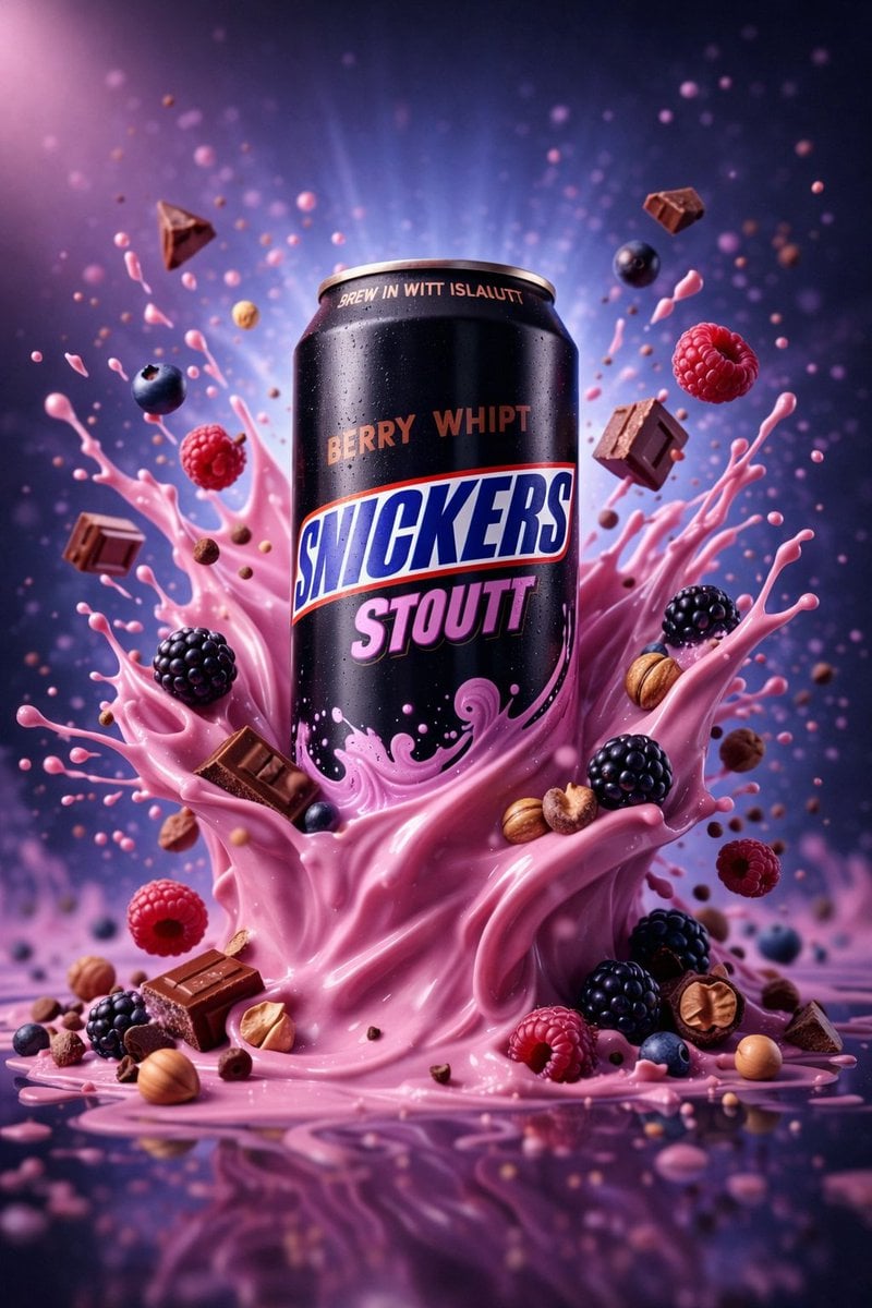
Hyper-Realistic Commercial Product Photography (Splash Effect)
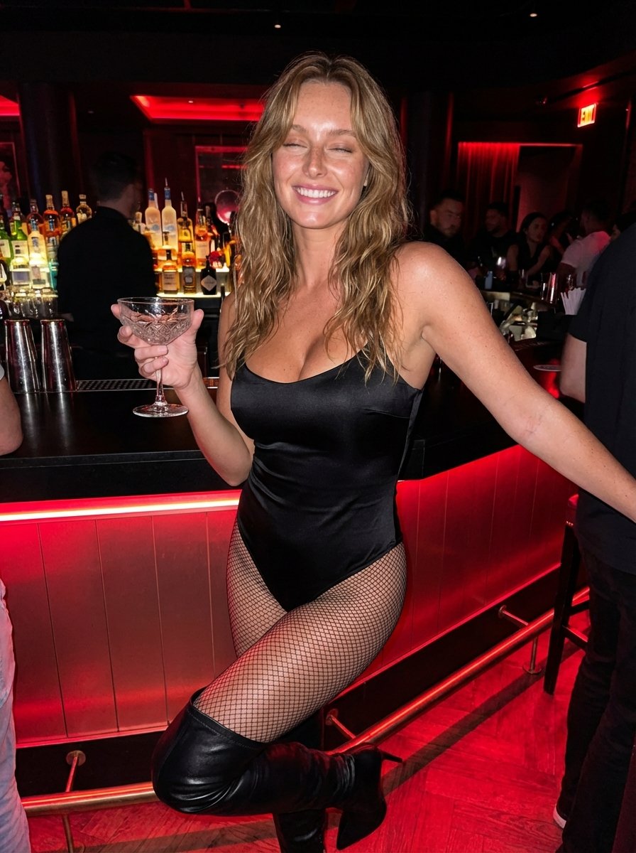
Hyper-Realistic Nightclub Portrait Prompt
More image prompts
Fresh picks from across the catalog.
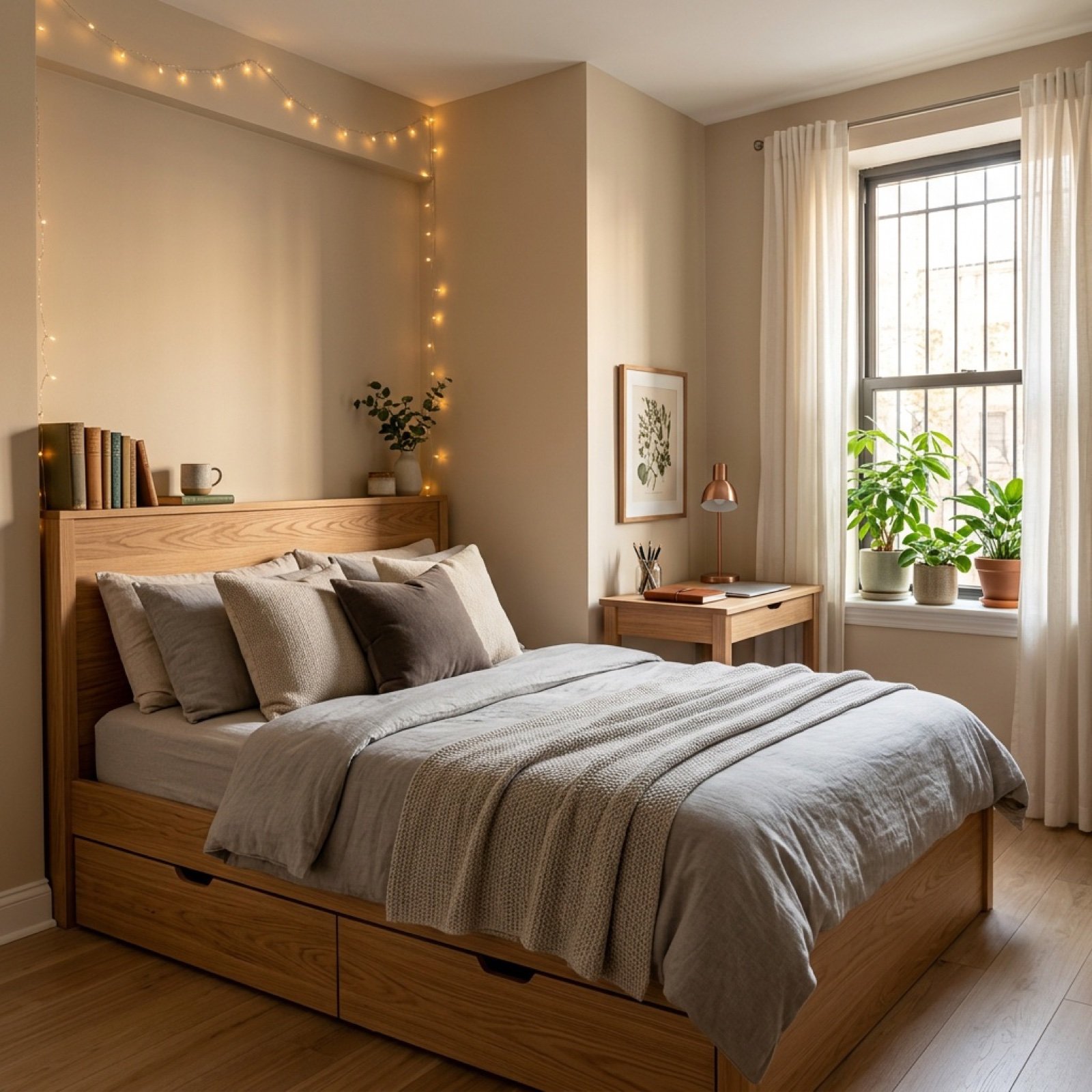
Video Transition Prompt (Room Renovation Timelapse)
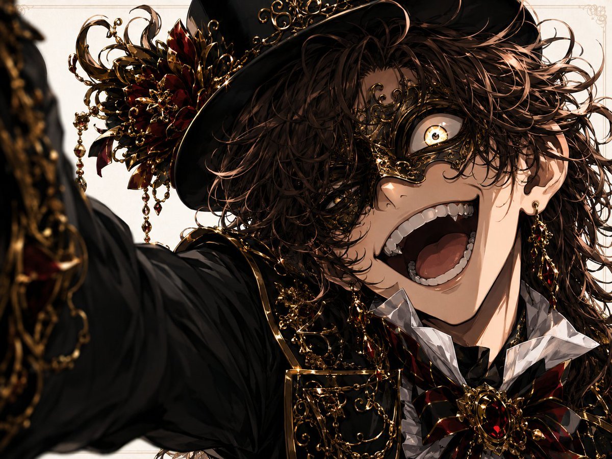
Wide-Angle Dramatic Facial Close-up
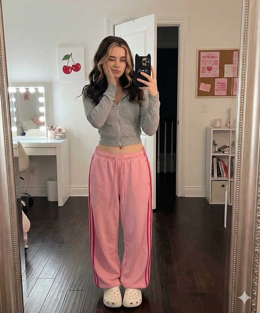
Y2K Aesthetic Mirror Selfie Prompt
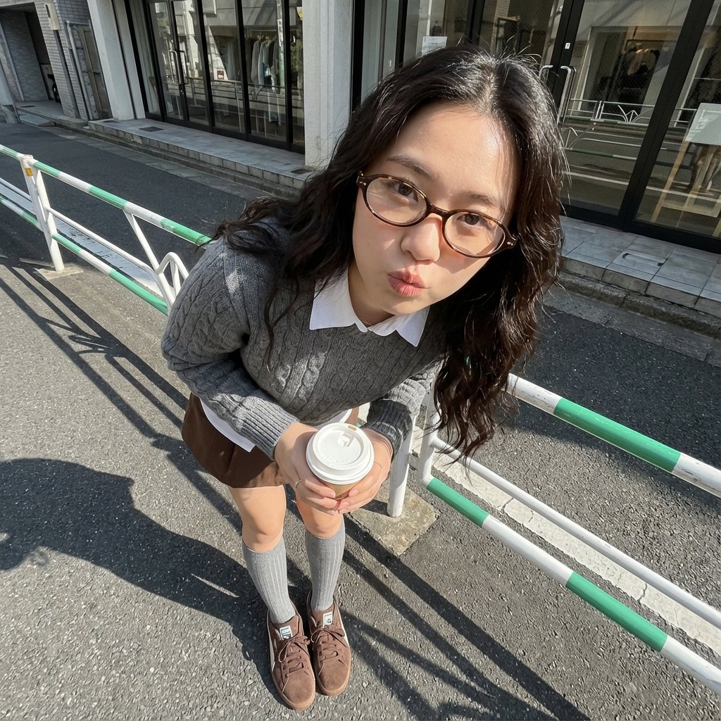
Photorealistic Cute Academic Street Photography Portrait
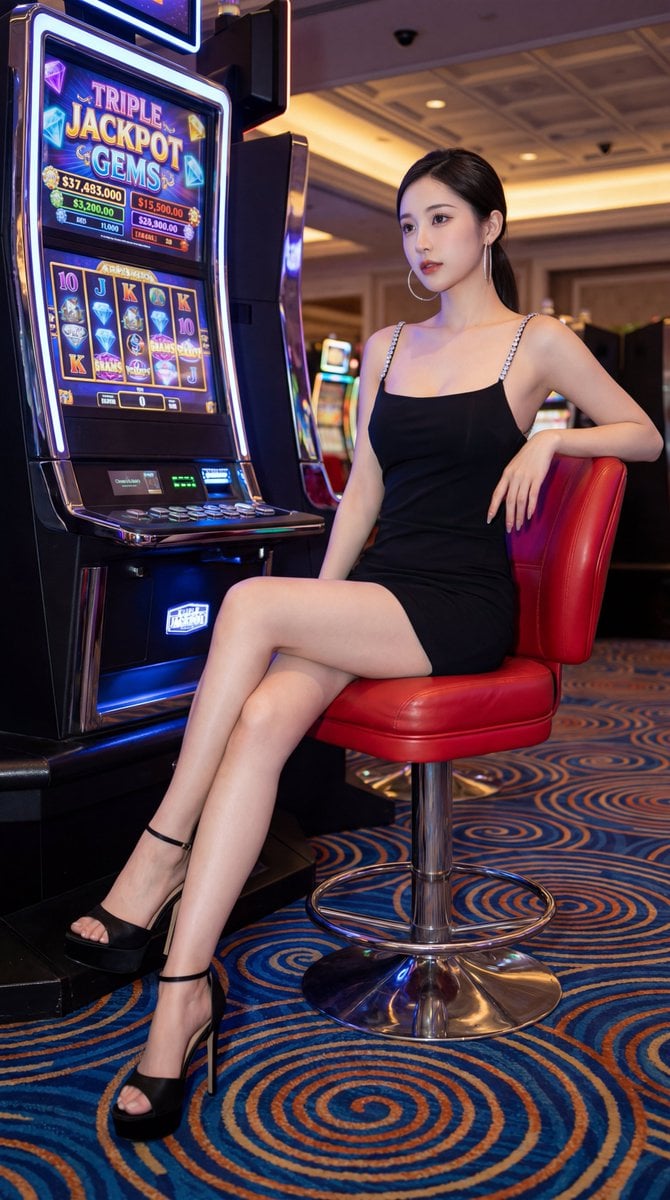
Chinese Casino Glamour Scene Prompt

Anime ChatGPT Companion in Study
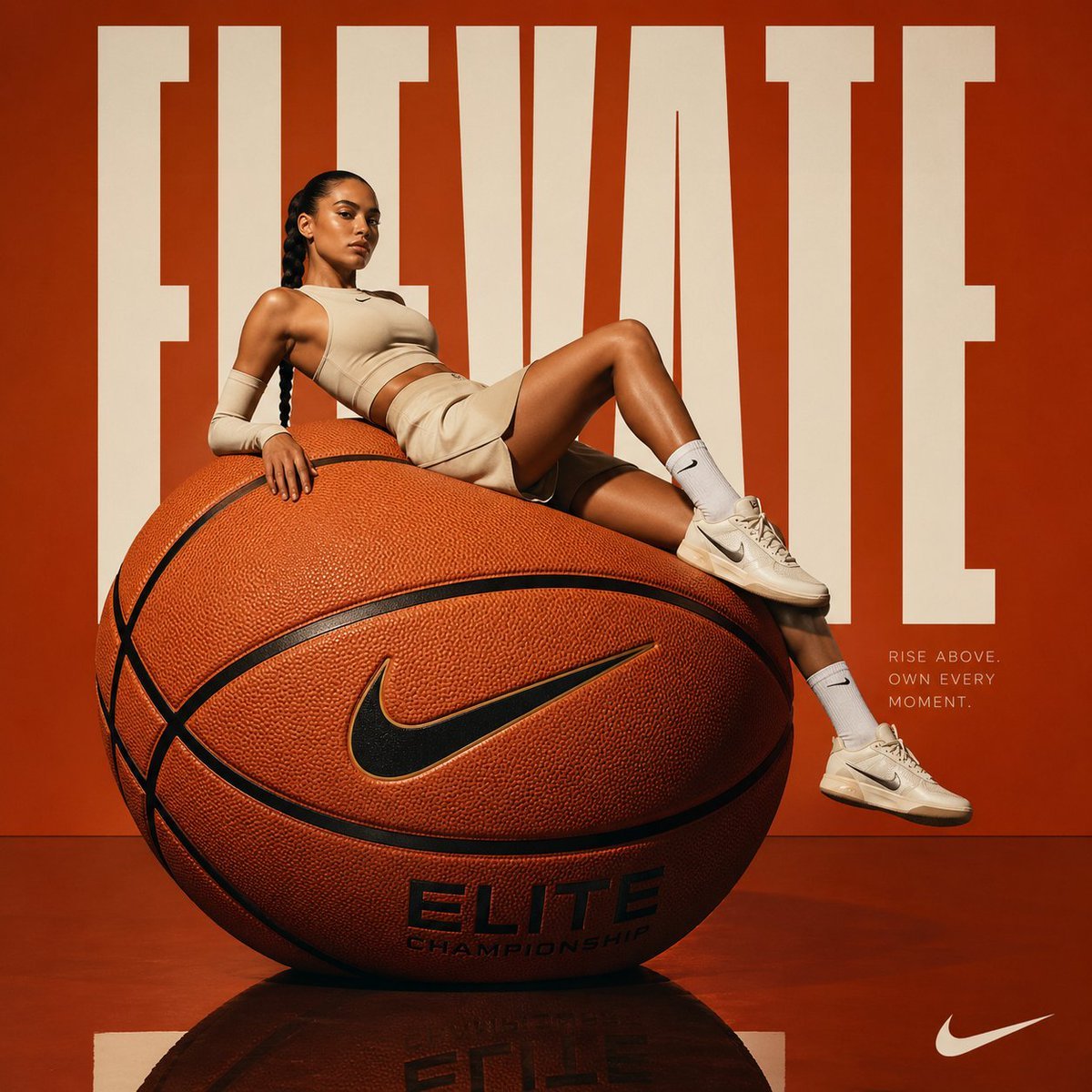
Avant-garde Basketball Fashion
Spanish UPS outlet wiring infographic
Futuristic Tech Product Advertisement Set
FIFA World Cup Sports Poster
Browse template categories
A hero crystal typography visual for a luxury brand campaign questions
How do I use the A hero crystal typography visual for a luxury brand campaign template?
Add your photo if the template asks for one, edit the prompt if you like — the template's model and format are already selected — and press Generate. Your version opens in PicX Studio.
Can I customize the A hero crystal typography visual for a luxury brand campaign template?
Yes. You can change the subject, setting, lighting, mood, format, and available model controls before creating your image.
Is the A hero crystal typography visual for a luxury brand campaign template free?
Opening and editing this template is free. Generating uses credits, shown on the Generate button when you are signed in.
Which AI model should I use?
Start with Nano Banana 2, which is the model associated with this template. You can compare another compatible model for a different finish.
Looking for something else? Browse all templates.

Your photo, any look
Thousands of ready templates for every top image and video model, from one credit balance.