
Retro Halftone Portrait Poster
A comprehensive structural prompt for converting reference photos into high-contrast, 1960s-70s inspired screen-printed halftone posters.
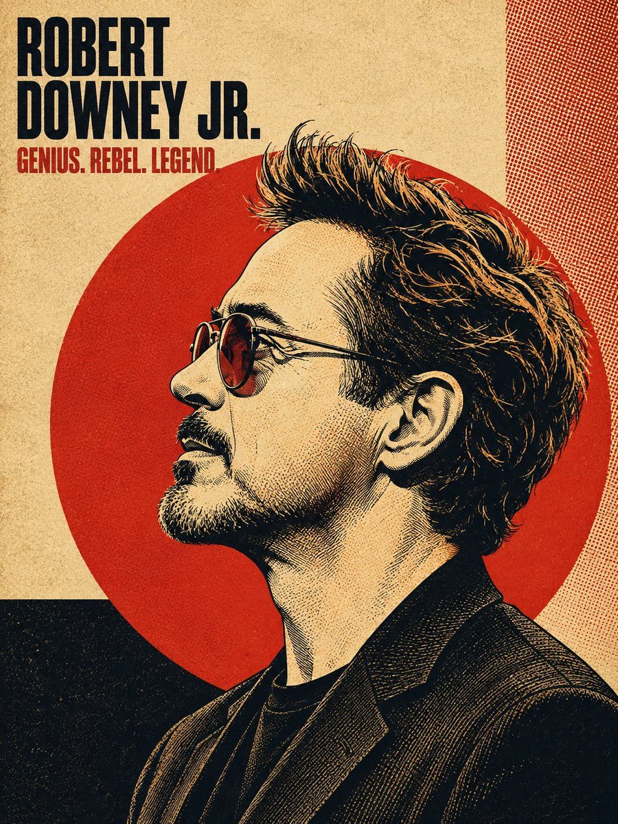
- Prompt included
- Model and format preset
- Free template
The prompt behind this image
Copy the exact prompt behind Retro Halftone Portrait Poster, or open it in the studio and make it yours.
- Task
- Convert the uploaded reference photo (or a well-known likeness of the named person) into a vintage halftone bold poster-art style portrait illustration.
- Input › Subject Name
- {{PERSON_NAME}}
- Input › Reference Image
- {{UPLOADED_PHOTO_OR_NULL}}
- Input › Note
- Only the subject's name or an uploaded photo should be required from the user. All other parameters below are fixed art-direction rules.
- Output Exclusions
- Do NOT include a small circular/rounded-corner inset photo of the real reference image in the corner of the poster — the final output is the illustration ONLY, full-bleed, no reference thumbnail overlay.
- Art Style › Medium
- digital illustration mimicking screen-printed / offset-lithograph poster art
- Art Style › Influences
- 1960s-70s bold political/protest poster art, Shepard Fairey-style bold stencil illustration, risograph print texture, vintage magazine cover design, retro concert/album poster art
- Art Style › Line Work
- high-contrast ink linework with fine cross-hatching and stippling for shading, visible pen/brush strokes in hair strands
- Art Style › Rendering
- flat color blocking combined with engraving-style fine line shading — NOT photorealistic, NOT airbrushed, NOT smooth gradient shading
- Composition › Pose
- subject's head and upper shoulders/chest in a strict 90-degree side profile (facing left), eyes looking straight ahead in profile, chin slightly lifted, neutral/confident expression
- Composition › Framing
- portrait orientation (4:5 or 3:4 aspect ratio), subject fills roughly 70-85% of vertical frame, cropped at mid-chest/shoulder
- Composition › Focal Backdrop
- a large solid-color circle (sun/halo motif) centered behind the subject's head, circle diameter roughly 60-70% of canvas width, subject's hair and shoulders slightly overlap and break the circle's edge
- Composition › Hair Treatment
- hair rendered as one of the most detailed elements — individual flowing strands, wind-swept or voluminous movement, strong directional lighting creating highlight streaks within the dark mass of hair
- Background › Base Texture
- coarse woven linen/canvas paper texture overlaid across the entire composition at low opacity
- Background › Layout
- asymmetric geometric color-block panels behind/around the circle — e.g. a solid dark rectangle in one lower corner, a contrasting stripe or panel along one edge, sometimes a fine halftone dot-pattern or crosshatch pattern filling one quadrant
- Background › Halftone Overlay
- visible CMYK-style halftone dot pattern subtly overlaid on background panels and occasionally bleeding into the portrait's shadow areas
- Background › Grain
- fine analog print grain/noise across the whole image for an aged, screen-printed look
- Color Palette › Instruction
- Select ONE cohesive limited palette (2-4 colors max) per poster, high contrast, no photographic gradients. Choose based on mood/subject or default to the classic scheme.
- Color Palette › Classic Scheme › Background Base
- warm cream / aged paper beige (#e8dcc4-ish)
- Color Palette › Classic Scheme › Accent Circle
- bold poster red (#c1272d-ish)
- Color Palette › Classic Scheme › Linework Shadow
- near-black ink (#1a1512-ish)
- Color Palette › Classic Scheme › Highlight
- same cream as background used for lit skin/hair areas
- Color Palette › Alt Scheme Dark › Background Base
- black or deep charcoal
- Color Palette › Alt Scheme Dark › Accent Circle
- poster red or burnt orange
Raw JSON
{ "task": "Convert the uploaded reference photo (or a well-known likeness of the named person) into a vintage halftone bold poster-art style portrait illustration.", "input": { "subject_name": "{{PERSON_NAME}}", "reference_image": "{{UPLOADED_PHOTO_OR_NULL}}", "note": "Only the subject's name or an uploaded photo should be required from the user. All other parameters below are fixed art-direction rules." }, "output_exclusions": [ "Do NOT include a small circular/rounded-corner inset photo of the real reference image in the corner of the poster — the final output is the illustration ONLY, full-bleed, no reference thumbnail overlay." ], "art_style": { "medium": "digital illustration mimicking screen-printed / offset-lithograph poster art", "influences": ["1960s-70s bold political/protest poster art", "Shepard Fairey-style bold stencil illustration", "risograph print texture", "vintage magazine cover design", "retro concert/album poster art"], "line_work": "high-contrast ink linework with fine cross-hatching and stippling for shading, visible pen/brush strokes in hair strands", "rendering": "flat color blocking combined with engraving-style fine line shading — NOT photorealistic, NOT airbrushed, NOT smooth gradient shading" }, "composition": { "pose": "subject's head and upper shoulders/chest in a strict 90-degree side profile (facing left), eyes looking straight ahead in profile, chin slightly lifted, neutral/confident expression", "framing": "portrait orientation (4:5 or 3:4 aspect ratio), subject fills roughly 70-85% of vertical frame, cropped at mid-chest/shoulder", "focal_backdrop": "a large solid-color circle (sun/halo motif) centered behind the subject's head, circle diameter roughly 60-70% of canvas width, subject's hair and shoulders slightly overlap and break the circle's edge", "hair_treatment": "hair rendered as one of the most detailed elements — individual flowing strands, wind-swept or voluminous movement, strong directional lighting creating highlight streaks within the dark mass of hair" }, "background": { "base_texture": "coarse woven linen/canvas paper texture overlaid across the entire composition at low opacity", "layout": "asymmetric geometric color-block panels behind/around the circle — e.g. a solid dark rectangle in one lower corner, a contrasting stripe or panel along one edge, sometimes a fine halftone dot-pattern or crosshatch pattern filling one quadrant", "halftone_overlay": "visible CMYK-style halftone dot pattern subtly overlaid on background panels and occasionally bleeding into the portrait's shadow areas", "grain": "fine analog print grain/noise across the whole image for an aged, screen-printed look" }, "color_palette": { "instruction": "Select ONE cohesive limited palette (2-4 colors max) per poster, high contrast, no photographic gradients. Choose based on mood/subject or default to the classic scheme.", "classic_scheme": { "background_base": "warm cream / aged paper beige (#e8dcc4-ish)", "accent_circle": "bold poster red (#c1272d-ish)", "linework_shadow": "near-black ink (#1a1512-ish)", "highlight": "same cream as background used for lit skin/hair areas" }, "alt_scheme_dark": { "background_base": "black or deep charcoal", "accent_circle": "poster red or burnt orange", "linework_shadow": "black ink", "highlight": "warm cream/tan" }, "alt_scheme_cool": { "background_base": "deep navy blue", "accent_circle": "muted brick-red/orange", "linework_shadow": "navy/black ink", "highlight": "warm cream, with the subject's true eye color kept naturally visible as the one full-color accent" }, "duotone_option": "for a graphic pop-art variant, render the entire subject in a single duotone (e.g. mustard-yellow and black, or gold and black) instead of cream/red/black" }, "typography": { "headline": { "content": "subject's name (first name, or first+last stacked on two lines)", "placement": "top-left corner of the poster, inset from edges", "font_style": "extra-bold condensed slab-serif or grotesque sans-serif, all caps, tightly kerned, stacked on 1-2 lines, large scale (dominant typographic element)", "color": "matches the linework/shadow ink color, occasionally with a subtle drop shadow or outline for depth" }, "subheadline": { "content": "a short 2-4 word tagline/epithet related to the subject (e.g. an evocative title, nickname, or descriptor)", "placement": "directly below the headline, smaller scale", "font_style": "bold condensed sans-serif or slab-serif, all caps, single line", "color": "the poster's accent color (matches the circle color)" } }, "clothing_and_accessories": { "styling": "simple, era-appropriate or modern minimal clothing rendered in flat color with the same halftone/linework shading as the rest of the piece — collared shirts, blazers, off-shoulder tops, or textured jackets with visible fabric-fold linework", "accessories": "keep minimal — small jewelry (earrings, necklace) can be included if present in reference, rendered as simple line-art shapes" }, "lighting": { "style": "single hard directional light source (as if raking across the side profile), creating strong graphic shadow shapes rather than realistic soft shading", "shadow_rendering": "shadows built from crosshatching, stippling, and halftone dot density rather than smooth gradients" }, "quality_and_fidelity": { "likeness": "preserve accurate, recognizable facial proportions and features of the subject from the reference photo/name, translated into the illustrated line-art style — the illustration must be clearly identifiable as that specific person", "resolution": "crisp, poster-print-ready quality, sharp linework, no blur, no photographic artifacts", "consistency": "maintain identical composition, palette rules, and typography placement described above regardless of subject, so the whole set reads as one unified poster series" }}How to use Retro Halftone Portrait Poster in 3 steps
- 1Upload ImagePNG, JPG or paste
Add your photo
Upload the photo the template builds on. The prompt, model and format are already set.
- 2…a portrait of your subject in softgolden-hour light, 85mm…
Personalize
Edit the subject and creative details for your destination.
- 3Generate
Generate
Press Generate — your image is created in PicX Studio, so you can compare it with the original and refine one variable at a time.
More like this
Templates with the same subject, style or setup. Open one to see its prompt.
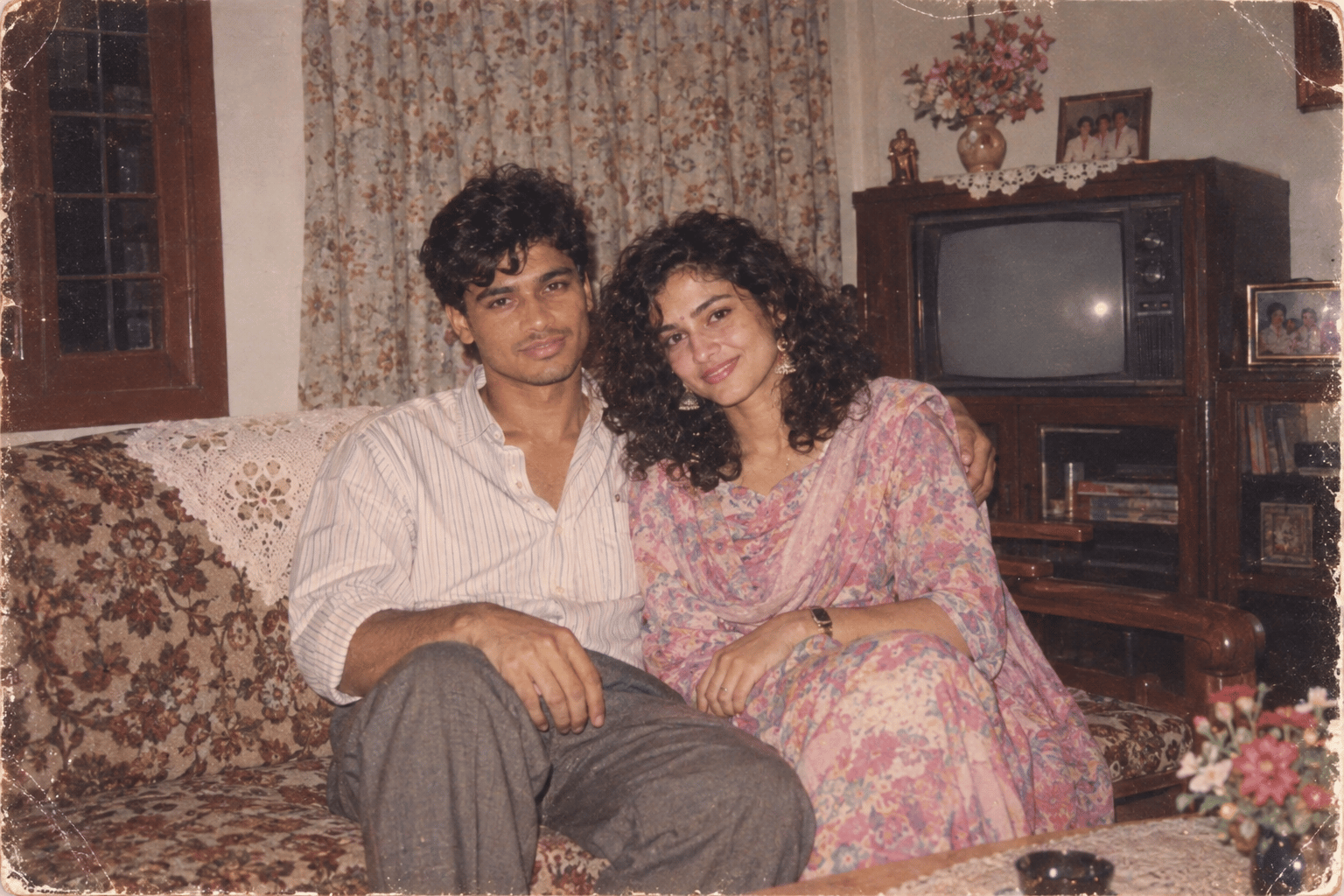
Found Photograph: Us, 1970
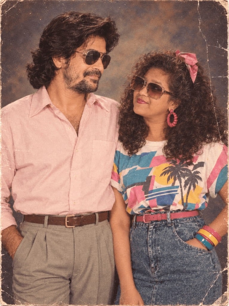
80s Couple Studio Portrait
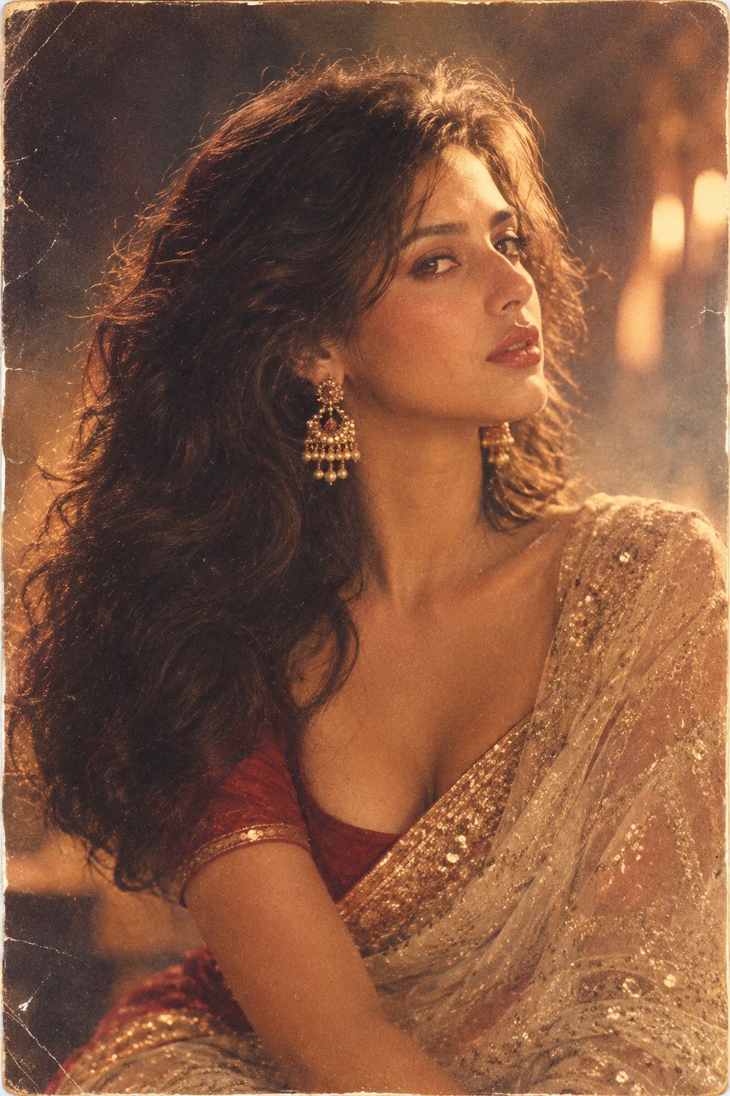
80s Bollywood Star
Monochrome Halftone Editorial Fashion Poster
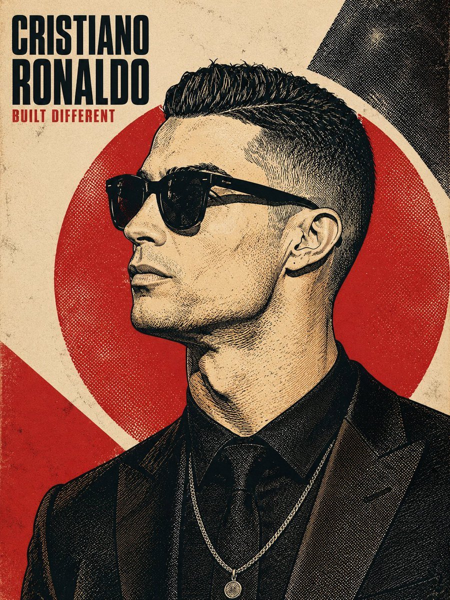
Vintage Halftone Portrait Poster
Two Tickets, One Night
If We Met in 1985
One Dance Before Midnight
Before We said Goodbye
Our Song was on a Cassette
Meet Me When It Rains
The Date After College
Make it yours
Retro Halftone Portrait Poster works as-is. These are the safest ways to change it without losing the look.
Swap the setting
Keep the rest of the prompt and replace the location block. The current setting is “coarse woven linen/canvas paper texture overlaid across the entire composition a”.
Swap the light
One lighting change is enough to compare takes. Current light: “same cream as background used for lit skin/hair areas”.
Change one field
Copy a single group, rewrite it, and generate again so you can see what that field is doing.
| If the result… | Why | Fix |
|---|---|---|
| The result drifts from the preview | Too many fields changed at once. | Reuse Retro Halftone Portrait Poster as-is first, then change one group — subject, light, or setting. |
| GPT Image 2 ignores part of the JSON | Some models flatten or skip nested keys. | Keep the same values and paste them as a short paragraph instead. |
More GPT Image 2 templates
Other prompts made for GPT Image 2.
Six VTuber Japanese Logo Sheet
Realistic Portrait of Woman and Deer
The Vista Modular Condo Poster
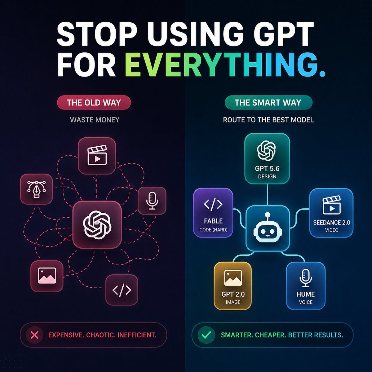
AI Model Routing Comparison Infographic
2.5D Anime Art Board
Isometric Productivity Desk Scene
New York Double Exposure Poster
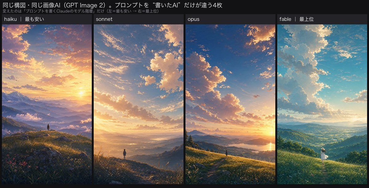
Four-Panel AI Landscape Comparison
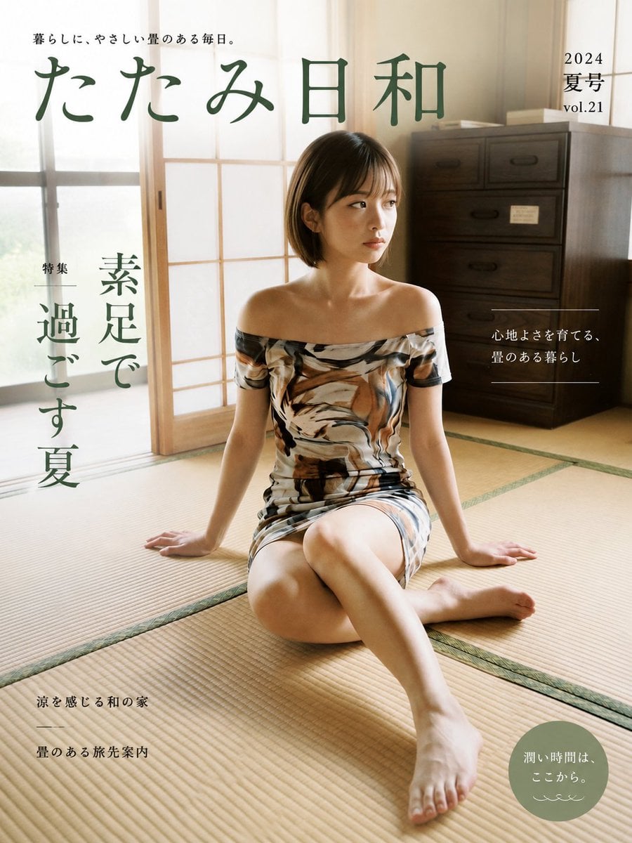
Japanese Tatami Lifestyle Magazine Cover
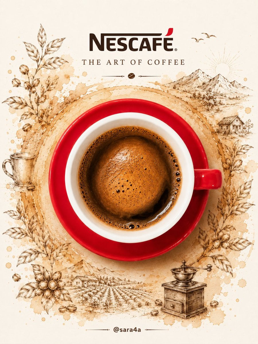
NESCAFÉ Coffee Map Poster
More image prompts
Fresh picks from across the catalog.
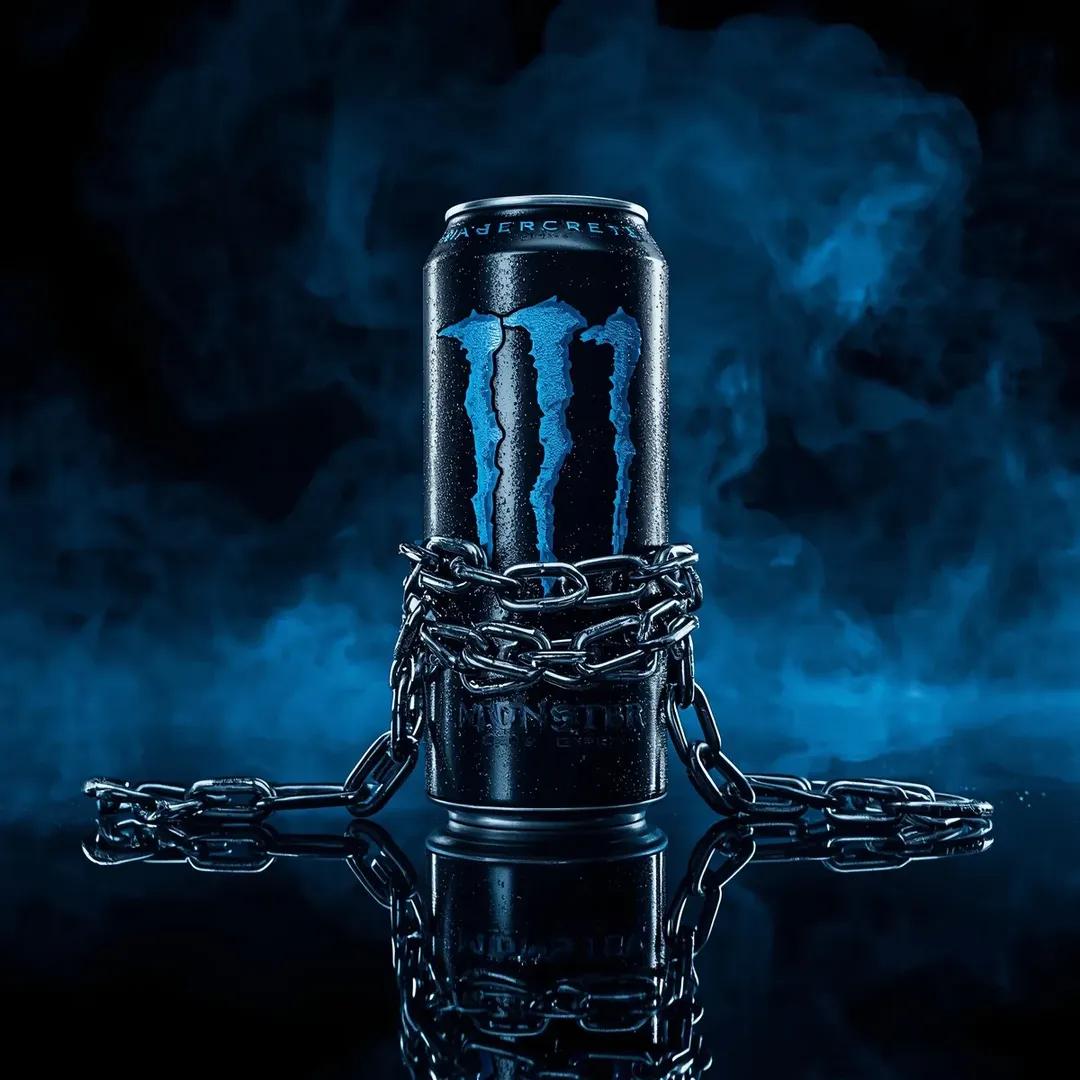
Dramatic Product Video Prompt for Monster Energy Drink
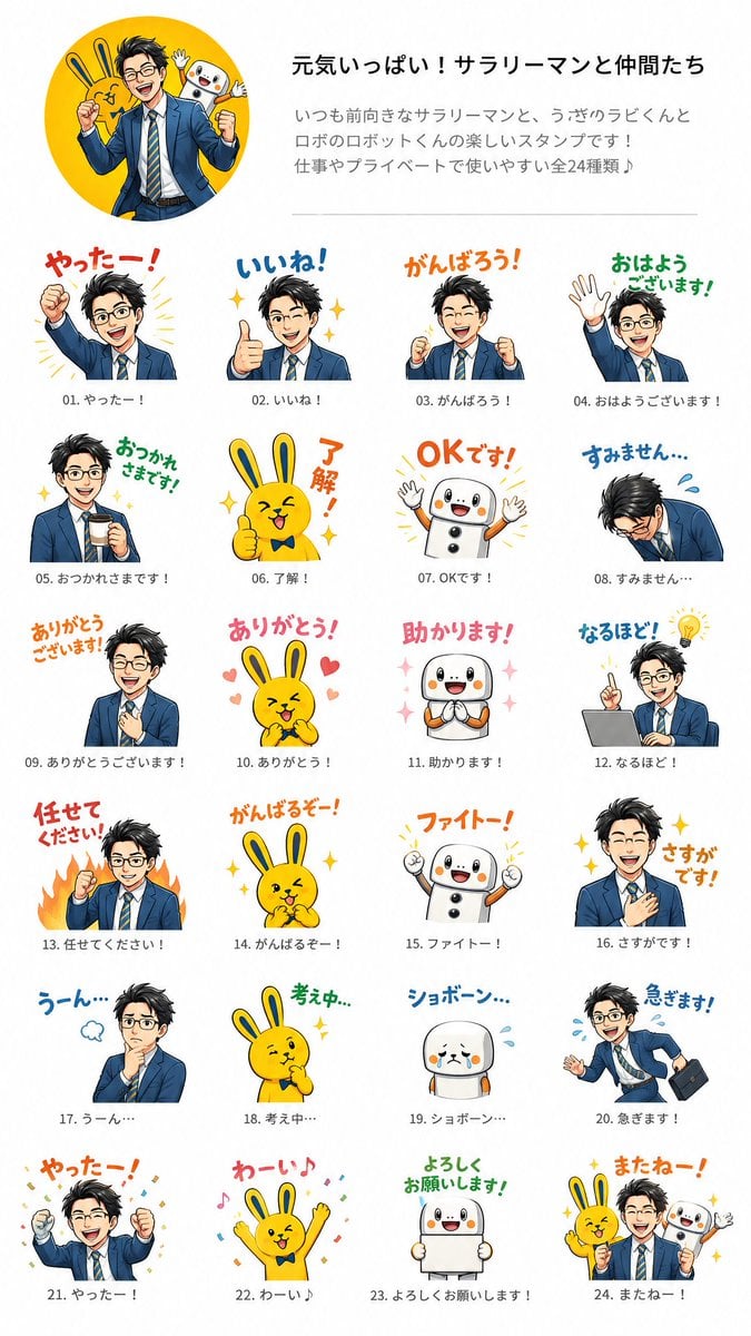
Salaryman LINE Sticker Set
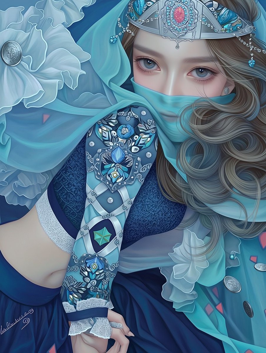
Ornate Blue Belly Dancer Illustration
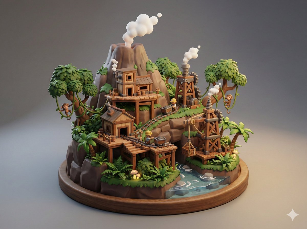
Collectible Miniature Diorama of a Rugged Mining Settlement
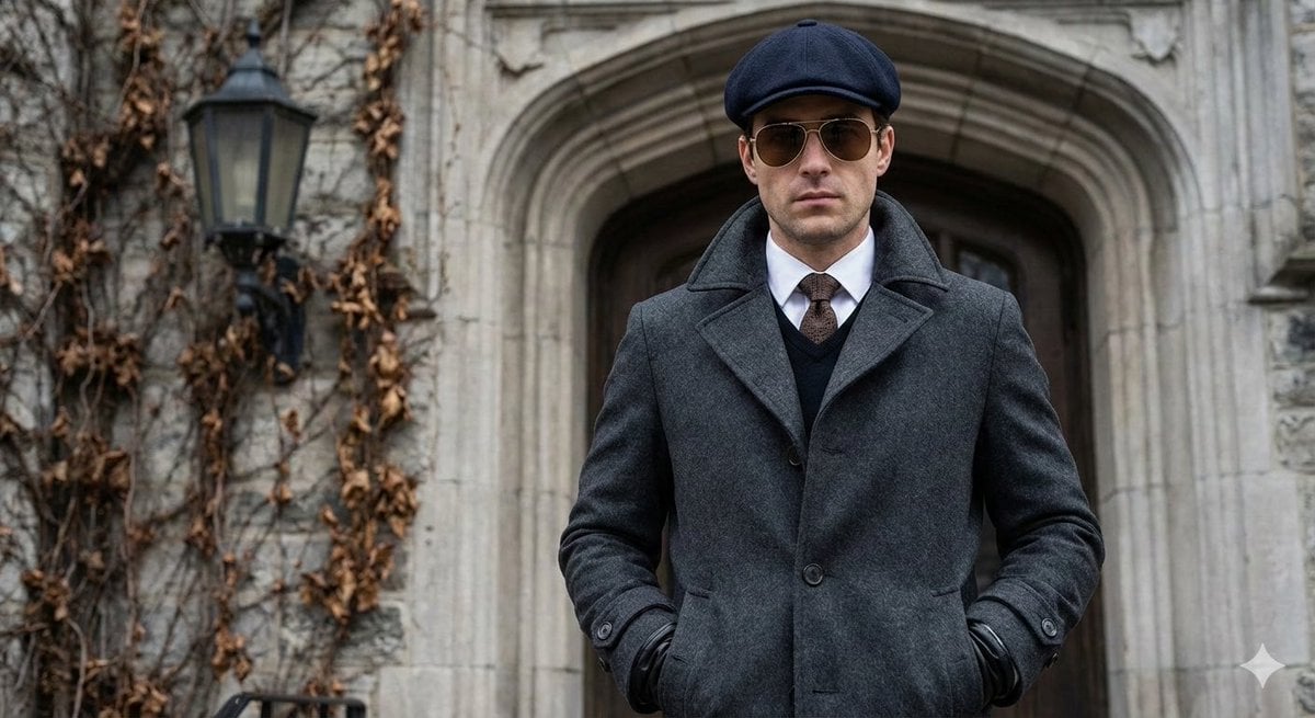
Cinematic Street Photography Editorial Portrait
Inpainting/Adding a Person to an Image

Explosive Japanese X Monetization Thumbnail

Transforming the Tower of the Sun into a Taro Okamoto Painting
Premium Masculine Editorial Portrait
Antarctic Penguin Encounter Photograph Prompt
Browse template categories
Retro Halftone Portrait Poster questions
How do I use the Retro Halftone Portrait Poster template?
Add your photo if the template asks for one, edit the prompt if you like — the template's model and format are already selected — and press Generate. Your version opens in PicX Studio.
Can I customize the Retro Halftone Portrait Poster template?
Yes. You can change the subject, setting, lighting, mood, format, and available model controls before creating your image.
Is the Retro Halftone Portrait Poster template free?
Opening and editing this template is free. Generating uses credits, shown on the Generate button when you are signed in.
Which AI model should I use?
Start with GPT Image 2, which is the model associated with this template. You can compare another compatible model for a different finish.
Looking for something else? Browse all templates.
Your photo, any look
Thousands of ready templates for every top image and video model, from one credit balance.