How do I use the DX Infographic Model Comparison template?
Edit the prompt in the box under the preview — the template's model and format are already selected — and press Generate. Your version appears right on this page.
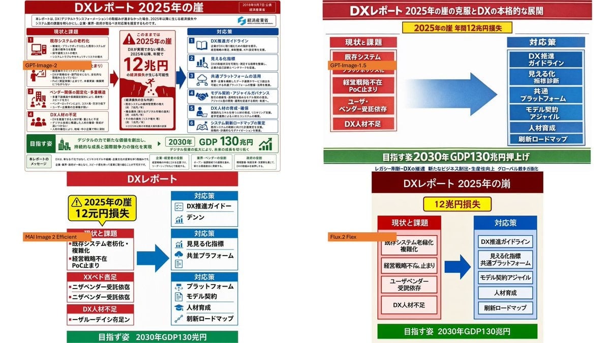
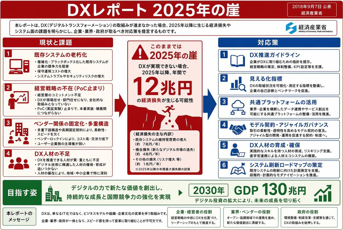
Creates a four-panel comparison collage showing different model-style recreations of a Japanese DX Report infographic from a reference image.

This template uses your photo — add one with the + button.
Using the provided reference image as the source infographic, create a 16:9 white-background comparison collage showing how different image models reproduce the same Japanese DX Report infographic. Layout: Arrange exactly 4 discrete panels in a 2×2-style collage: top-left, top-right, bottom-left, bottom-right. Keep generous white spacing between panels. Panels: 1. Top-left: show a mostly faithful smaller copy of the reference infographic, preserving the dense Japanese text, red/blue/green government-report layout, central “2025 cliff / 12 trillion yen loss” warning, left-side issues, right-side countermeasures, and bottom 2030 GDP goal. Add an orange label reading {argument name="top left model label" default="GPT-Image-2"} over the left-middle area. 2. Top-right: create a cleaner simplified ponchi-e style version of the same content with a red title bar, a yellow warning strip, a red stacked “current issues” box on the left, a large blue arrow in the center, a blue stacked “countermeasures” box on the right, and a green goal bar at the bottom. Add an orange label reading {argument name="top right model label" default="GPT-Image-1.5"} near the left issue box. 3. Bottom-left: create a more distorted simplified vertical version with a red “DX Report” header, yellow warning box, red issue blocks on the left, blue countermeasure boxes on the right, a large blue arrow, and green bottom goal bar. Add an orange label reading {argument name="bottom left model label" default="MAI Image 2 Efficient"} across the left side. 4. Bottom-right: create a simplified beige-background version with a dark red header, yellow “12 trillion yen loss” warning, red issue column, blue countermeasure column, large blue arrow, and green bottom goal bar. Add an orange label reading {argument name="bottom right model label" default="Flux.2 Flex"} near the left issue column. Content to preserve conceptually: the comparison should clearly reference {argument name="report topic" default="DX Report 2025 cliff"}, with the same core flow from current problems to countermeasures and the 2030 GDP growth target. Make the top-left panel the most accurate and dense; make the other three panels visibly more simplified and less text-faithful, as a model-comparison visual. Constraints: Use exactly 4 panels and exactly 4 orange model labels. Keep the Japanese infographic style readable where possible, with no extra watermark or unrelated objects.
Using the provided reference image as the source infographic, create a 16:9 white-background comparison collage showing how different image models reproduce the same Japanese DX Report infographic. Layout: Arrange exactly 4 discrete panels in a 2×2-style collage: top-left, top-right, bottom-left, bottom-right. Keep generous white spacing between panels. Panels: 1. Top-left: show a mostly faithful smaller copy of the reference infographic, preserving the dense Japanese text, red/blue/green government-report layout, central “2025 cliff / 12 trillion yen loss” warning, left-side issues, right-side countermeasures, and bottom 2030 GDP goal. Add an orange label reading {argument name="top left model label" default="GPT-Image-2"} over the left-middle area. 2. Top-right: create a cleaner simplified ponchi-e style version of the same content with a red title bar, a yellow warning strip, a red stacked “current issues” box on the left, a large blue arrow in the center, a blue stacked “countermeasures” box on the right, and a green goal bar at the bottom. Add an orange label reading {argument name="top right model label" default="GPT-Image-1.5"} near the left issue box. 3. Bottom-left: create a more distorted simplified vertical version with a red “DX Report” header, yellow warning box, red issue blocks on the left, blue countermeasure boxes on the right, a large blue arrow, and green bottom goal bar. Add an orange label reading {argument name="bottom left model label" default="MAI Image 2 Efficient"} across the left side. 4. Bottom-right: create a simplified beige-background version with a dark red header, yellow “12 trillion yen loss” warning, red issue column, blue countermeasure column, large blue arrow, and green bottom goal bar. Add an orange label reading {argument name="bottom right model label" default="Flux.2 Flex"} near the left issue column. Content to preserve conceptually: the comparison should clearly reference {argument name="report topic" default="DX Report 2025 cliff"}, with the same core flow from current problems to countermeasures and the 2030 GDP growth target. Make the top-left panel the most accurate and dense; make the other three panels visibly more simplified and less text-faithful, as a model-comparison visual. Constraints: Use exactly 4 panels and exactly 4 orange model labels. Keep the Japanese infographic style readable where possible, with no extra watermark or unrelated objects.
DX Infographic Model Comparison needs input media to work. Open it in the studio and these load alongside the prompt — pick whichever ones your chosen model can take.
Edit the prompt in the box under the preview — the template's model and format are already selected — and press Generate. Your version appears right on this page.
Yes. You can change the subject, setting, lighting, mood, format, and available model controls before creating your image.
Opening and editing this template is free. Generating uses credits, shown on the Generate button when you are signed in.
Start with GPT Image 2, which is the model associated with this template. You can compare another compatible model for a different finish.
Follow a topic to a crawlable collection of related PicX Studio templates.