
Structured Knowledge Architecture Infographic
A complex system prompt for generating professional, grid-based knowledge maps with high-saturation accent colors and clear hierarchy.
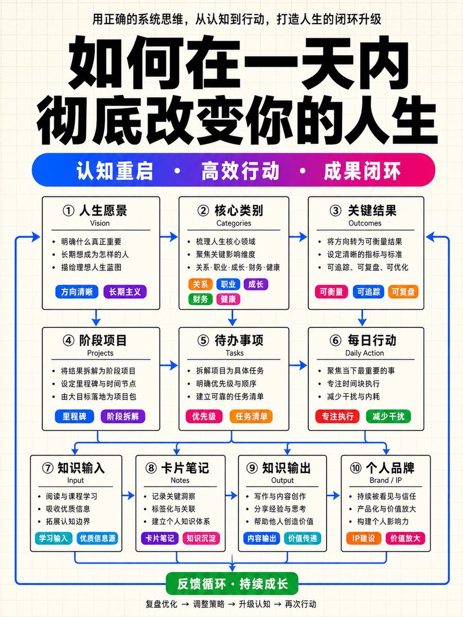
- Prompt included
- Model and format preset
- Free template
The prompt behind this image
Copy the exact prompt behind Structured Knowledge Architecture Infographic, or open it in the studio and make it yours.
Please generate a Chinese-language premium knowledge-structure infographic, in a vertical 9:16 composition. The overall visual language is fixed as: a pale off-white grid-paper background + a cover-level, oversized black sans-serif title + a highly saturated blue-purple-magenta gradient keyword pill bar + white modules with black borders + multicolored small pill labels inside the modules + blue arrows forming a closed-loop connection. This is not an ordinary flowchart, and not a tech UI panel. Generate a premium infographic that looks like the cover of a high-quality knowledge-influencer course, a knowledge-paid-content system diagram, or a methodology-structure poster. The overall look must be restrained, clean, and strongly ordered, but the local colored labels must be eye-catching enough to make the image richer and more layered in color than an ordinary black-and-white structure diagram. ━━━━━━━━━━━━━━━━ 1. Fixed Visual Style ━━━━━━━━━━━━━━━━ Background: Use a pale off-white grid-paper background. The background has very fine, very light gray grid lines. Gradient backgrounds are forbidden. Dark backgrounds are forbidden. Large areas of shadow, glow, frosted glass, skeuomorphic cards, tech HUDs, cyber UI, or fancy illustration are forbidden. Overall tone: The structure is extremely minimal, restrained, rational, and orderly. The main skeleton is a black-and-white structure. Color is used only for the keyword pill bar, small labels, local emphasis blocks, and the blue arrows. Do not turn the modules into large areas of colored cards. Do not make it look like a gradient-style business PPT. Do not make it into a complex mind map. Do not make it into an ordinary flowchart. The correct direction is: a black-and-white structural skeleton + locally high-color labels + blue connecting lines + cover-level title typography. ━━━━━━━━━━━━━━━━ 2. Fixed Layout of the Top Title Area ━━━━━━━━━━━━━━━━ From top to bottom, the top area consists of: A top caption line positioned at the very top of the image. Centered. Set in small black or dark gray text. Its content is automatically distilled from the "content" provided below, expressing the theme of this image. Normal font weight — not too bold. An oversized main title in Chinese: Use the "top title" variable as the main title. The main title must be the largest visual element in the entire image. Use an ultra-bold Chinese sans-serif (heiti), extremely heavy weight, with a strong, imposing presence. The title occupies the main visual area at the top of the image. The title must not be thin, small, or thrown away lightly. The title may be split into 1–2 lines, but must retain cover-level visual impact. A horizontal, highly saturated gradient keyword pill bar: Positioned below the main title. It is not three separate labels, but one single long horizontal rounded pill bar. The pill bar's color must transition from blue to purple, then to magenta/purplish-red. Inside the pill bar are 3 core keywords. The 3 keywords are automatically distilled from the "content." The keywords are set in bold white text. The keywords are separated by white dots. This gradient pill bar is the second visual anchor of the whole image, and must be eye-catching, vivid, and refined. Format example: Keyword One · Keyword Two · Keyword Three ━━━━━━━━━━━━━━━━ 3. Fixed Rules for the Main Module Structure ━━━━━━━━━━━━━━━━ The body uses a three-tier module structure, strictly aligned and evenly spaced: Tier 1: 3 modules. Tier 2: 3 modules. Tier 3: 4 modules. A total of 10 white modules with black borders. Module appearance: All modules must have a white base. Use thin black outlines. Use very small rounded corners or near-right-angle rectangles. No large rounded corners. No soft drop shadows. No glowing borders. No glassy texture. Keep clear spacing and grid alignment between modules. Each module uniformly contains: A Chinese module title: medium size, slightly bold, clear and eye-catching. An English subtitle: small size, lighter weight, gray-black. 2–4 short lines of content: normal weight, brief and restrained. Colored small pill labels: automatically inserted based on meaning, to serve as emphasis. Module text length control: Keep the Chinese module title to 2–6 characters. Keep the English subtitle to 1–3 English words. Keep each body line to 6–14 Chinese characters. Keep the small pill labels to 2–6 characters. Remove repetitive, vague, or overly long phrasing, and prioritize keeping short, information-dense sentences. ━━━━━━━━━━━━━━━━ 4. Automatic Content Layout Rules ━━━━━━━━━━━━━━━━ The user only provides the "top title" and one whole paragraph of natural-language "content." Do not require the user to manually break it into modules. You must automatically complete the understanding, distillation, categorization, compression, and tag-based layout. Please automatically generate the information structure according to the following logic: Top caption line: Distill one sentence of thematic explanation from the content. Style should be like the small cover text of a knowledge influencer. Short and summarizing, no more than 22 Chinese characters. Gradient keyword bar: Distill 3 core keywords from the content. Each keyword should be 2–5 characters. Must be highly summarized, suitable as cover keywords. Separate them with white dots. Tier 1, 3 modules: Strategy layer / Cognition layer / Result layer. Prioritize carrying: vision, goals, categories, core judgments, final results, system value. Tier 2, 3 modules: Project layer / Action layer / Execution layer. Prioritize carrying: projects, actions, methods, tasks, operational paths, execution mechanisms. Tier 3, 4 modules: Input layer / Notes layer / Output layer / Brand layer. Prioritize carrying: input sources, information organization, note accumulation, content output, productization, brand/IP amplification and dissemination, feedback loop. If the content includes the following types of information, prioritize turning them into colored small pill labels rather than plain body text: category, tag, source, channel, method, tool, emphasis point, differentiation, productization, branding, growth, amplification, IP. If the original content lacks sufficient information: Still maintain the 3 + 3 + 4 module structure. You may make reasonable generalizations based on the semantics of the original text. Do not fabricate specific data, real cases, people, institutions, years, or proportions. For uncertain content, use abstract but concrete phrasing to fill in, such as "content assets," "method accumulation," "feedback optimization." ━━━━━━━━━━━━━━━━ 5. Rules for Colored Accents Inside Modules ━━━━━━━━━━━━━━━━ The rich sense of color in the whole image must come from local small labels, not large areas of background color. At least 5 modules must contain highly saturated colored small pill labels inside them. At least 3 different functional types of modules must have small pill labels. The small pill labels must be rounded, highly saturated, white text, and delicately sized. Recommended color pool: blue, purple, magenta/purplish-red, pinkish red, orange, green, cyan-blue. There should be clearly visible color variation between different labels — do not use the exact same blue for all of them. Label usage suggestions: Category-type modules: multiple differently colored small pills arranged horizontally. Source-type modules: blue, cyan-blue, and purple labels. Method-type modules: pinkish-red or purplish-red emphasis labels. Brand/amplification-type modules: orange or magenta emphasis labels. Feedback/closed-loop-type modules: green or cyan-blue labels. Example small pill labels: "Input Source" "Tagging" "Reuse" "Productization" "IP Amplification" ━━━━━━━━━━━━━━━━ 6. Blue Arrow Closed-Loop Rules ━━━━━━━━━━━━━━━━ Arrow style: All arrows uniformly use a medium-to-high saturation blue. Lines should be clear, clean, and have a strong presence. No gray arrows. Not too thick. No messy tangling. Arrow relationships: The arrows must express a sense of systemic flow, not a static table. Flowing from Tier 1 to Tier 2. Flowing from Tier 2 to Tier 3. Tier 3 then flows back to the upper tiers or the top via return arrows, forming a closed loop. There can be a relatively large number of arrows, but they must be neat, restrained, and orderly. Closed-loop logic: The image needs to express: Cognition/Goals → Action/Execution → Input/Output/Brand → Feedback/Amplification → Feedback Optimization ━━━━━━━━━━━━━━━━ 7. Text Hierarchy and Font Weight ━━━━━━━━━━━━━━━━ A clear hierarchy must be formed — not all text should be the same weight. From strongest to weakest, the font weights are: Main title: the boldest, largest, with the strongest visual impact. Gradient keyword bar text: bold white, the second visual tier. Module Chinese titles: medium, slightly bold. Colored small pill label text: medium-bold. Module body text: normal weight. English subtitles: lighter weight. Full-page bold black text is forbidden. All text being the same size is forbidden. Body text overpowering the main title's visual weight is forbidden. ━━━━━━━━━━━━━━━━ 8. Final Image Acceptance Criteria ━━━━━━━━━━━━━━━━ Before generating, self-check that the final image satisfies all of the following criteria at the same time: Is there a pale off-white grid-paper background? Is there a centered top caption line? Is there an oversized, ultra-bold, cover-level Chinese sans-serif main title? Is there one full blue-purple-magenta gradient keyword pill bar? Does the gradient pill bar contain 3 bold white keywords separated by white dots? Is it a three-tier structure with 3 + 3 + 4 modules? Are all modules white with thin black outlines and small rounded or near-right-angle corners? Do at least 5 modules contain highly saturated colored small pill labels inside them? Do the colored labels include multiple variations such as blue, purple, magenta, orange, green, and cyan-blue? Are blue arrows used to form a closed-loop system flowing from top to bottom and back again? Is the overall look restrained, premium, and orderly, rather than flashy, techy, a business-gradient style, or an ordinary flowchart? If any item is not satisfied, please fix it first before generating the final image. ━━━━━━━━━━━━━━━━ 9. Prohibited Items ━━━━━━━━━━━━━━━━ Prohibited: gradient backgrounds, dark backgrounds, large areas of colored cards, large areas of soft shadow, frosted glass, tech UI, glowing borders, skeuomorphic illustration, complex illustrated characters, ordinary business-PPT style, ordinary flowchart style, mind-map style, all modules the same color, all text the same weight, gray arrows, missing colored small pill labels, missing blue closed-loop arrows, missing top gradient keyword bar ━━━━━━━━━━━━━━━━ 10. The User Only Needs to Modify the Following Two Variables ━━━━━━━━━━━━━━━━ Top title: [Fill in the main title here] Content: [Fill in one whole paragraph of natural-language content here. No need to split it into modules, no need to write labels, no need to write layout instructions. Automatically distill the top caption line, 3 keywords, the three-tier 10-module structure, colorful small pill labels, and the blue arrow closed-loop structure.]
How to use Structured Knowledge Architecture Infographic in 3 steps
- 1Upload ImagePNG, JPG or paste
Add your photo
Upload the photo the template builds on. The prompt, model and format are already set.
- 2…a portrait of your subject in softgolden-hour light, 85mm…
Personalize
Edit the subject and creative details for your destination.
- 3Generate
Generate
Press Generate — your image is created in PicX Studio, so you can compare it with the original and refine one variable at a time.
More like this
Templates with the same subject, style or setup. Open one to see its prompt.
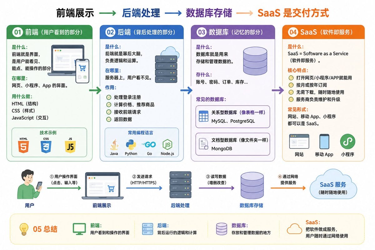
IT Architecture Knowledge Infographic
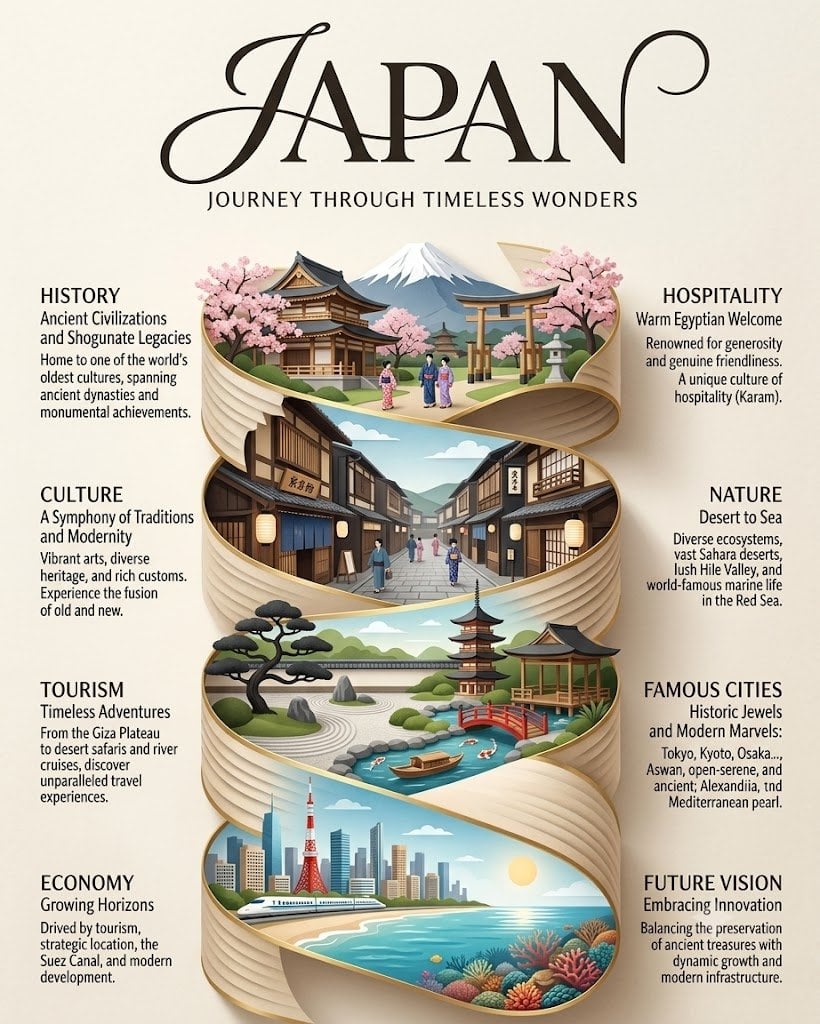
Japan Travel Brochure Poster
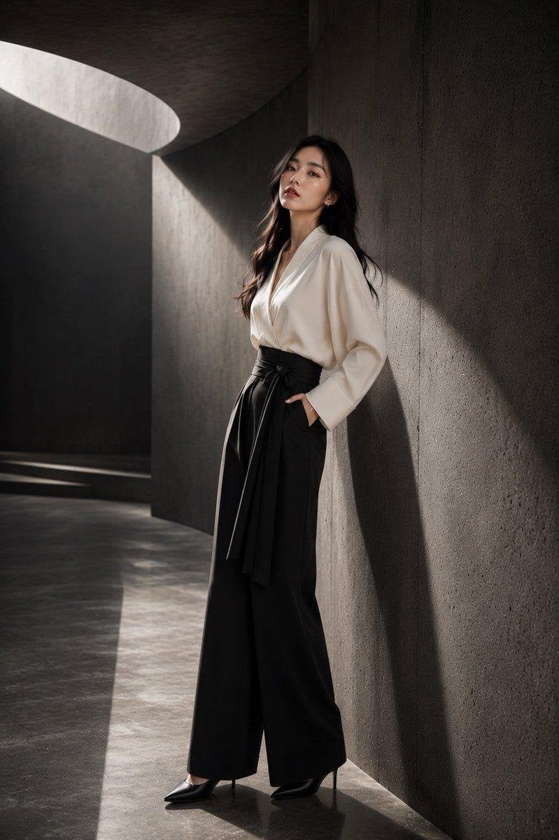
Japanese Architectural Concrete Studio Fashion Campaign

Japanese Minimalist Concrete Studio Fashion Editorial
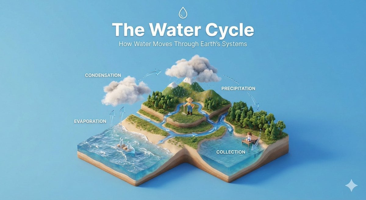
Isometric Process Educational Diorama
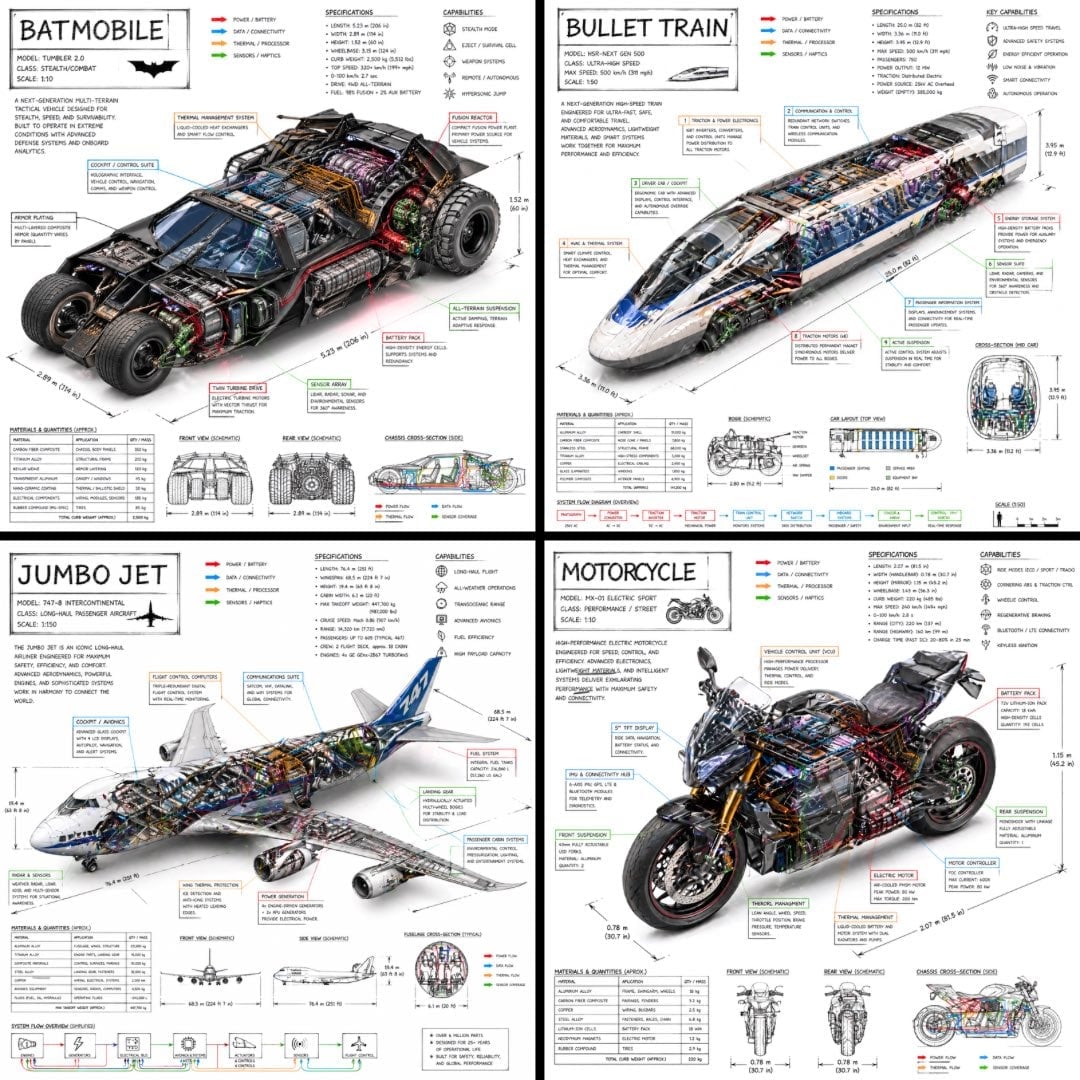
Isometric Vehicle Teardown Infographic Template

Modular Knowledge Encyclopedia Infographic
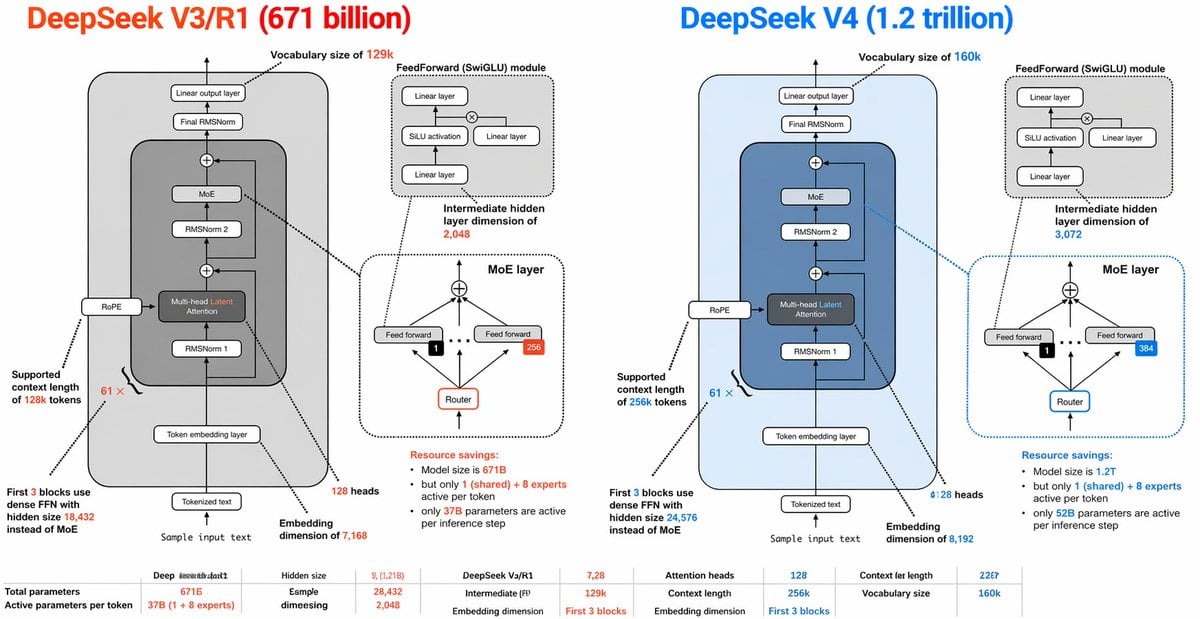
DeepSeek V3 vs V4 Architecture Infographic
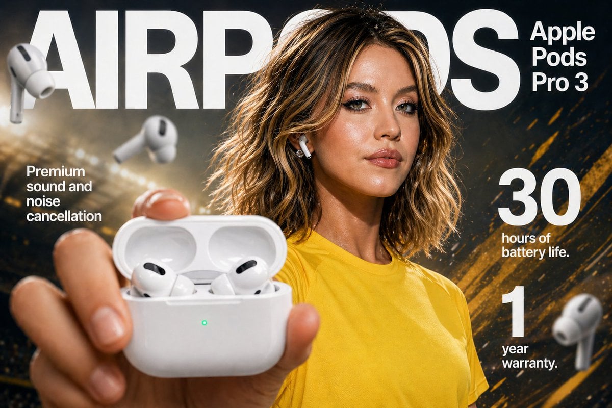
Gpt2 E Commerce Main Image Earbuds E Commerce Infographic
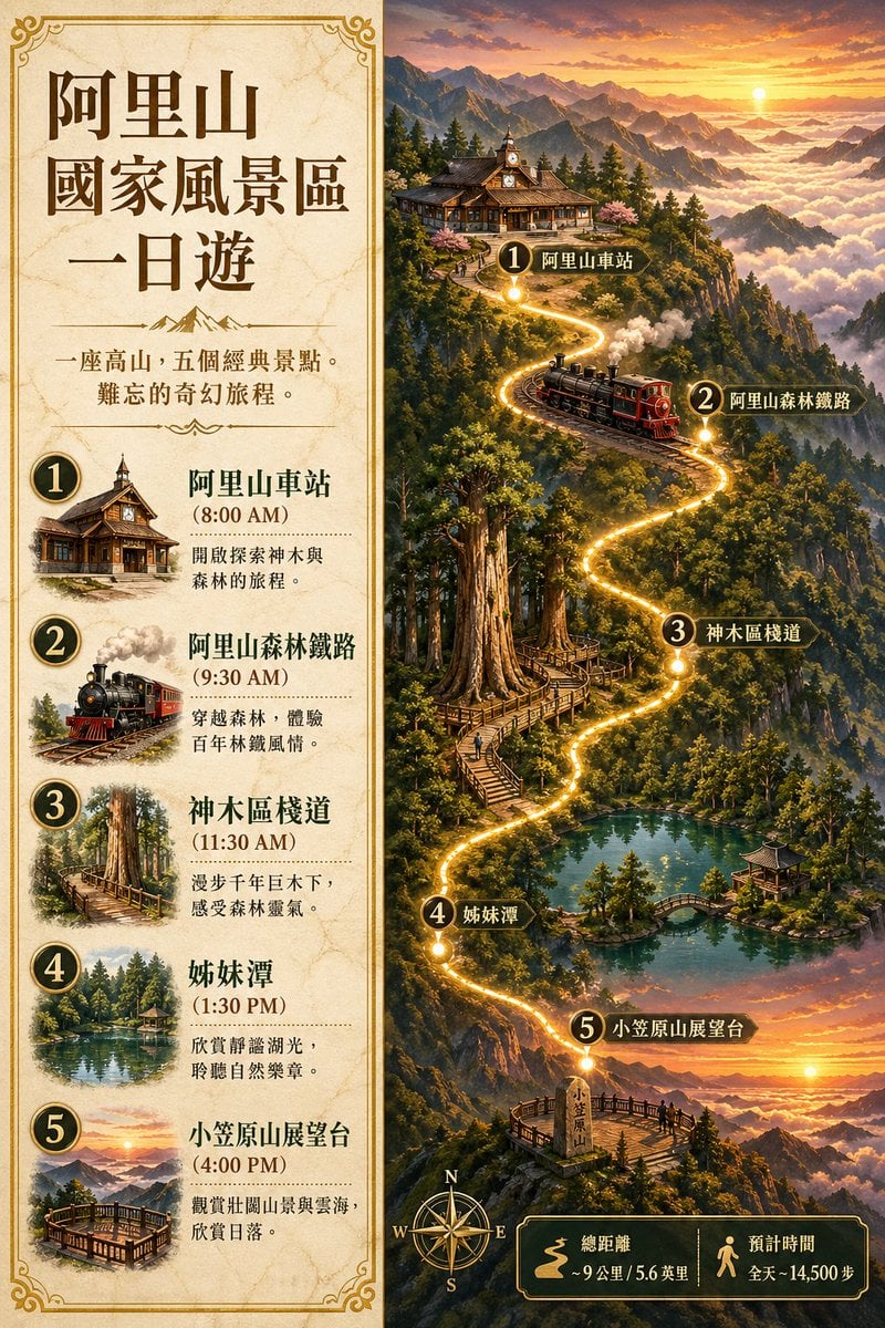
Gpt2 Infographic Edu Visual Alishan One Day Travel Poster

Gpt2 Infographic Edu Visual Ethnographic Plate for Tibetan Ceremonial Hat
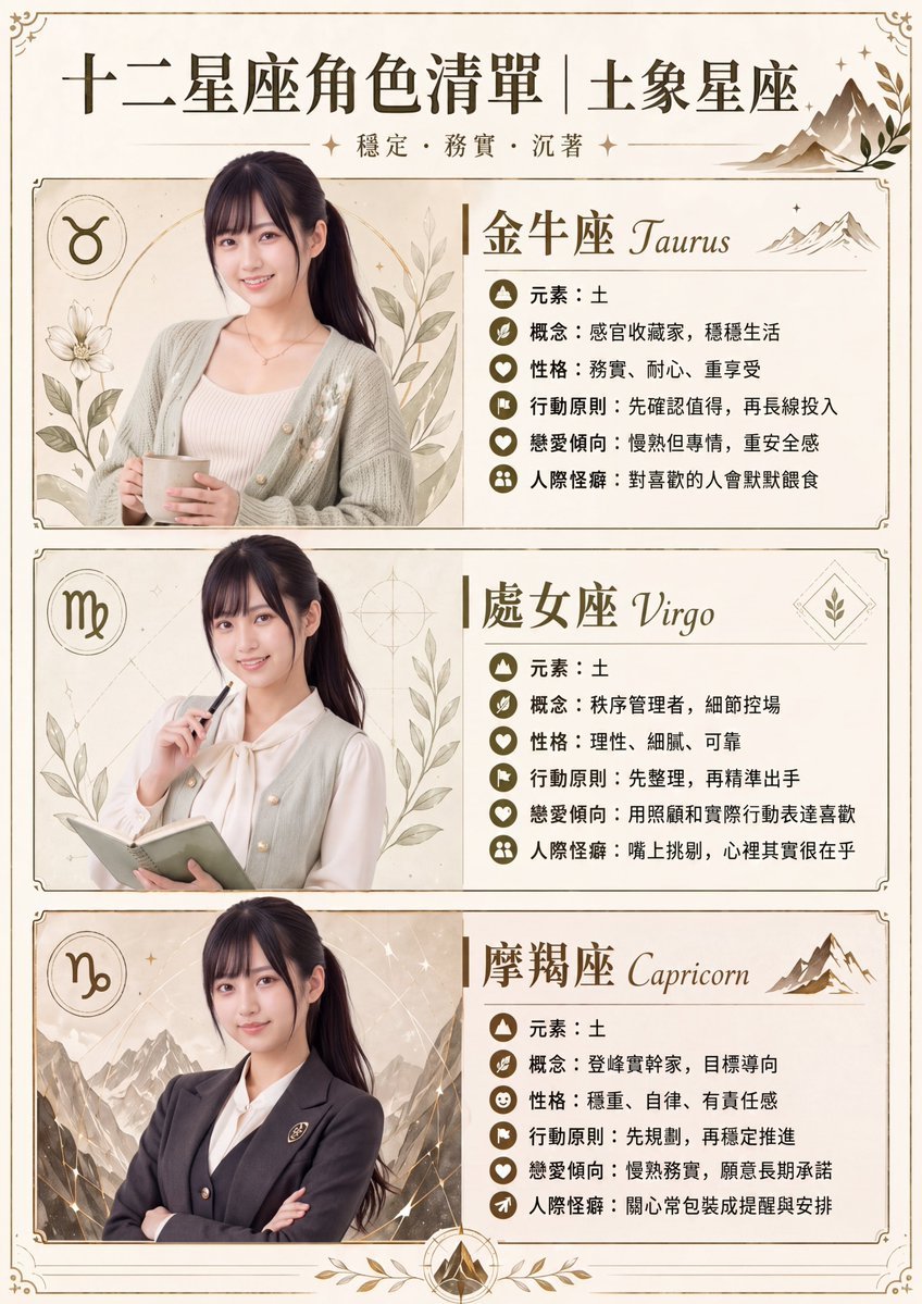
Gpt2 Infographic Edu Visual Earth Signs Zodiac Character Poster
Make it yours
Structured Knowledge Architecture Infographic works as-is. These are the safest ways to change it without losing the look.
Change one field
Copy a single group, rewrite it, and generate again so you can see what that field is doing.
Keep the frame, change the subject
Hold the composition and light of Structured Knowledge Architecture Infographic, then swap wardrobe, props or the person for a new take.
| If the result… | Why | Fix |
|---|---|---|
| The result drifts from the preview | Too many fields changed at once. | Reuse Structured Knowledge Architecture Infographic as-is first, then change one group — subject, light, or setting. |
| The model over-stylizes the scene | The prose prompt leaves finish and camera underspecified. | Add one camera or lighting sentence and stay on GPT Image 2. |
More GPT Image 2 templates
Other prompts made for GPT Image 2.
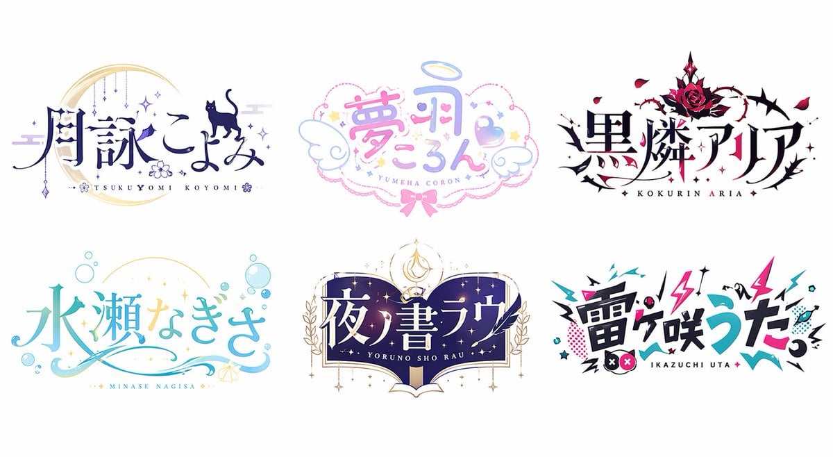
Six VTuber Japanese Logo Sheet

Realistic Portrait of Woman and Deer
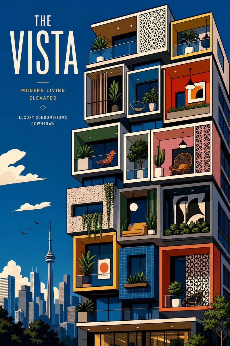
The Vista Modular Condo Poster
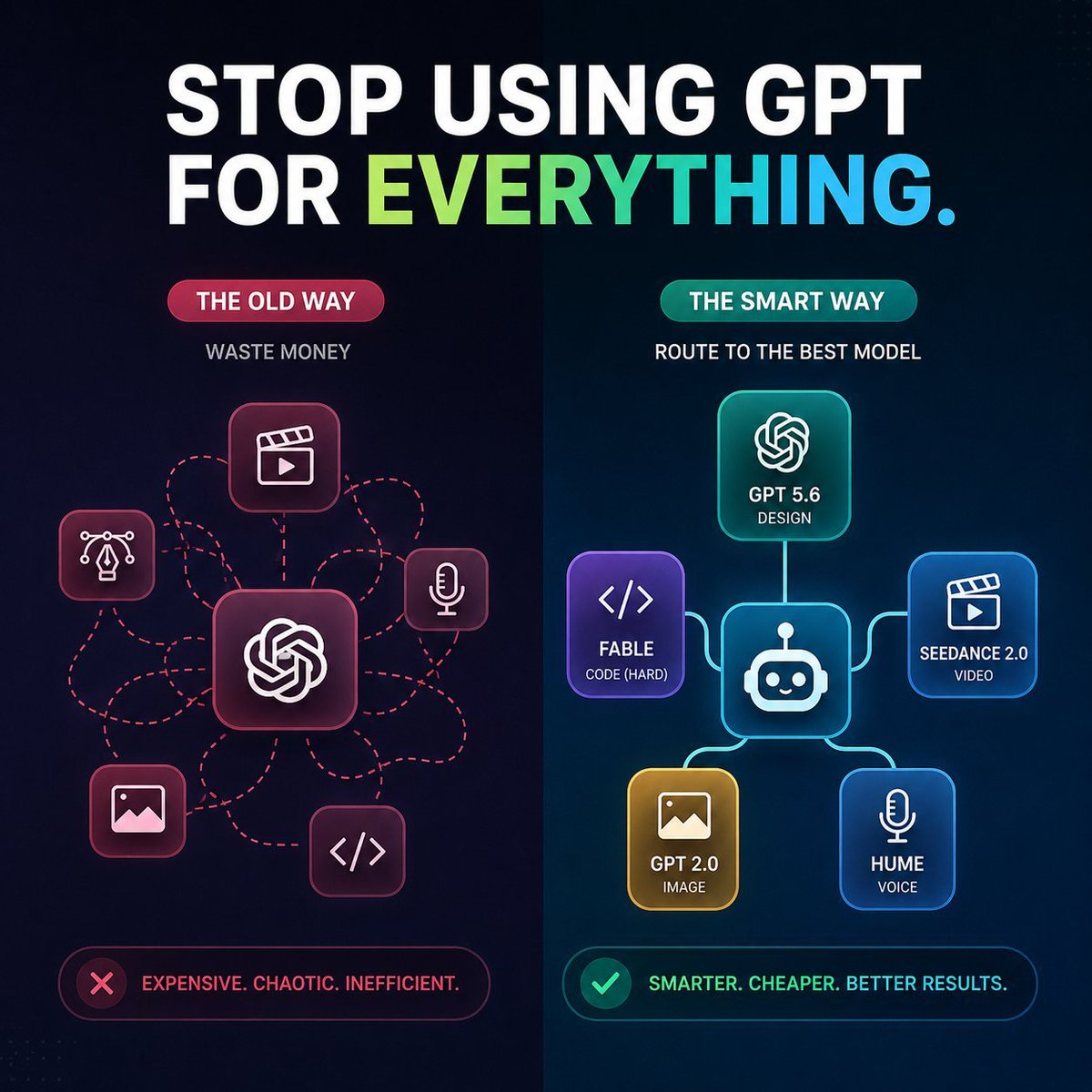
AI Model Routing Comparison Infographic
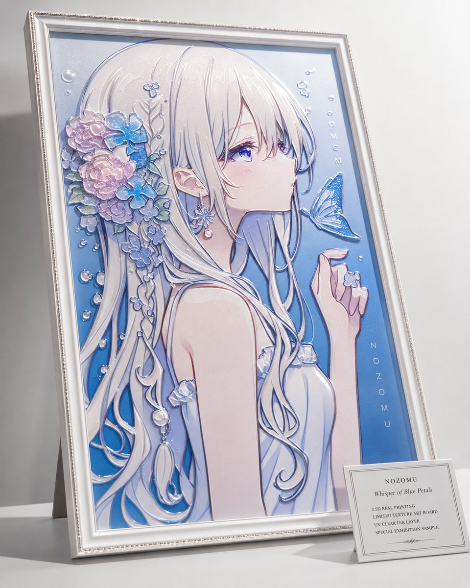
2.5D Anime Art Board

Isometric Productivity Desk Scene

New York Double Exposure Poster
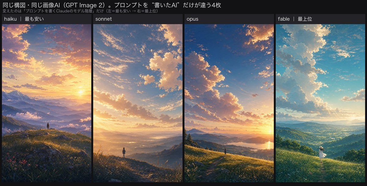
Four-Panel AI Landscape Comparison

Japanese Tatami Lifestyle Magazine Cover

NESCAFÉ Coffee Map Poster
More image prompts
Fresh picks from across the catalog.
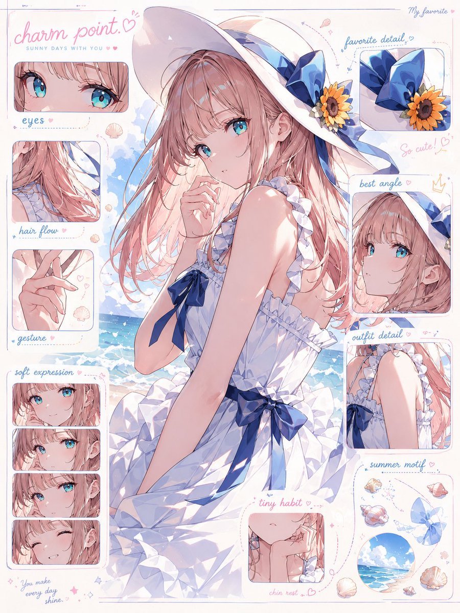
Anime Charm Point Analysis Sheet

Monochromatic Editorial Portrait Prompt for Gemini Nano Banana 2

KFC Booth iPhone Snapshot
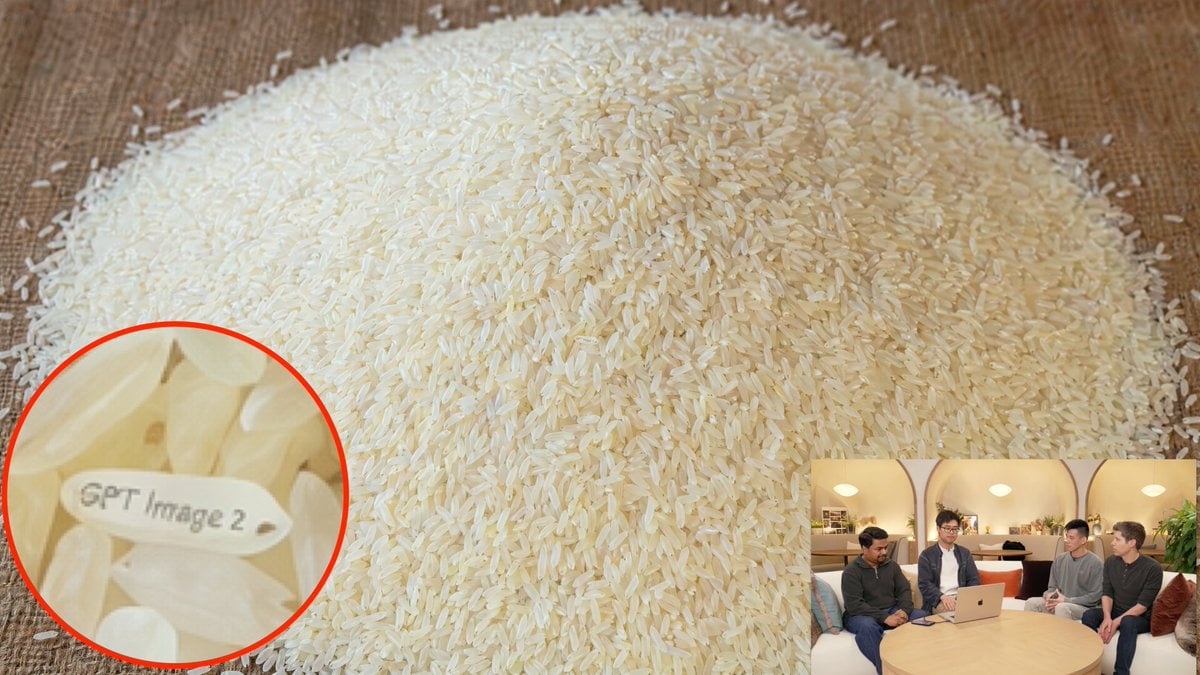
Hidden Engraved Rice Grain

Luxury Coffee Advertisement Portrait
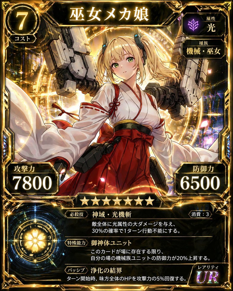
Ultra Rare Miko Mecha Card

Minimalist Golden Hour Selfie
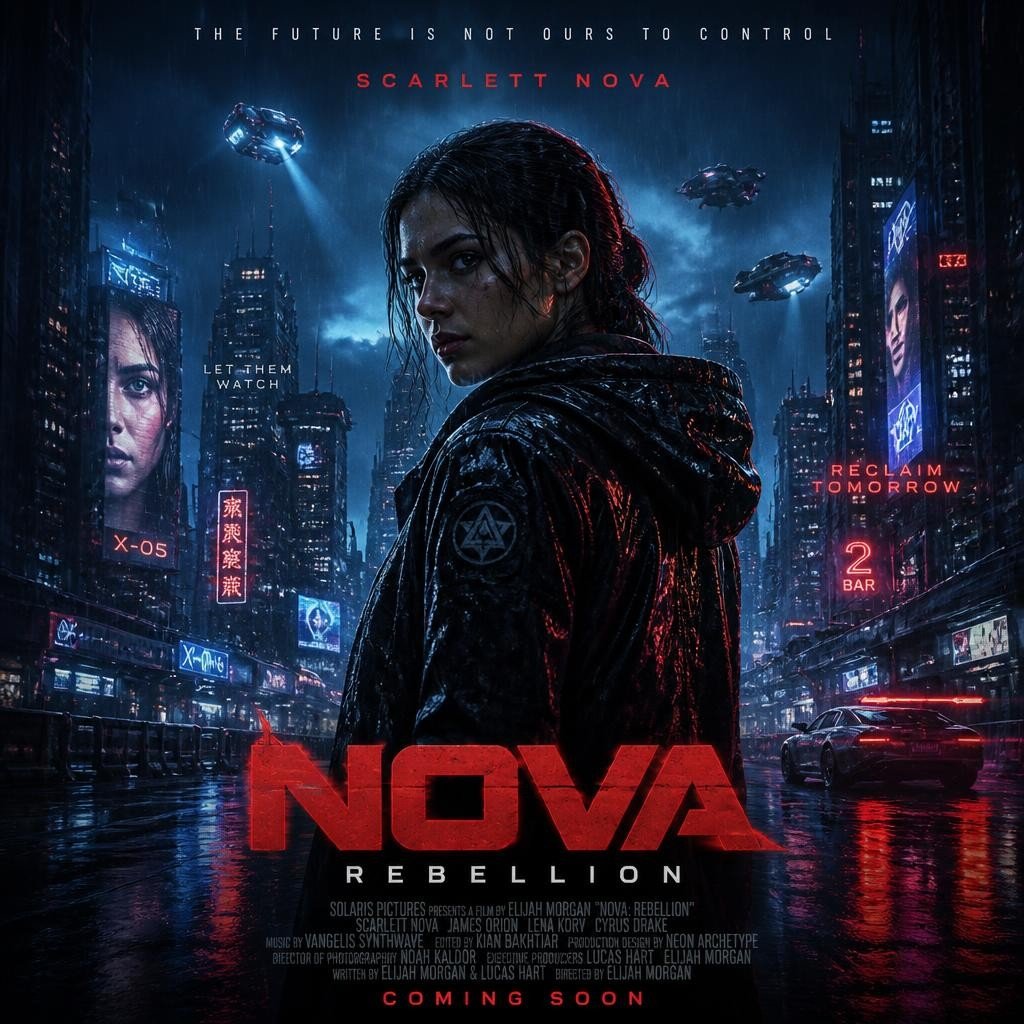
Cyberpunk Nova Rebellion Poster

Hyper-Realistic Street View of Man Leaning on BMW
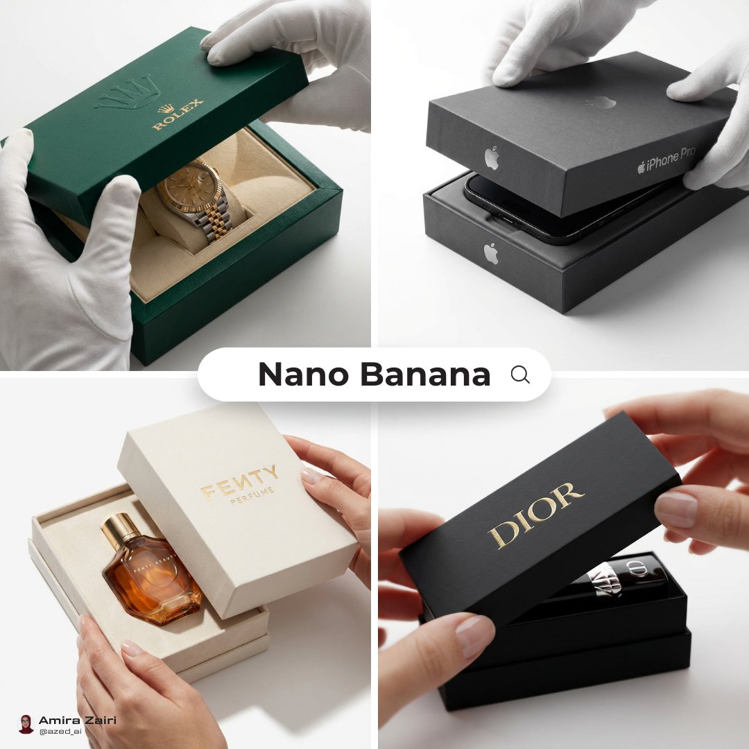
Luxury Packaging Reveal Prompt for Leonardo AI
Browse template categories
Structured Knowledge Architecture Infographic questions
How do I use the Structured Knowledge Architecture Infographic template?
Add your photo if the template asks for one, edit the prompt if you like — the template's model and format are already selected — and press Generate. Your version opens in PicX Studio.
Can I customize the Structured Knowledge Architecture Infographic template?
Yes. You can change the subject, setting, lighting, mood, format, and available model controls before creating your image.
Is the Structured Knowledge Architecture Infographic template free?
Opening and editing this template is free. Generating uses credits, shown on the Generate button when you are signed in.
Which AI model should I use?
Start with GPT Image 2, which is the model associated with this template. You can compare another compatible model for a different finish.
Looking for something else? Browse all templates.

Your photo, any look
Thousands of ready templates for every top image and video model, from one credit balance.