
Microsoft 365 Model Comparison Infographic
Generates a four-panel comparison slide showing different image models rendering Microsoft 365 ecosystem infographics.
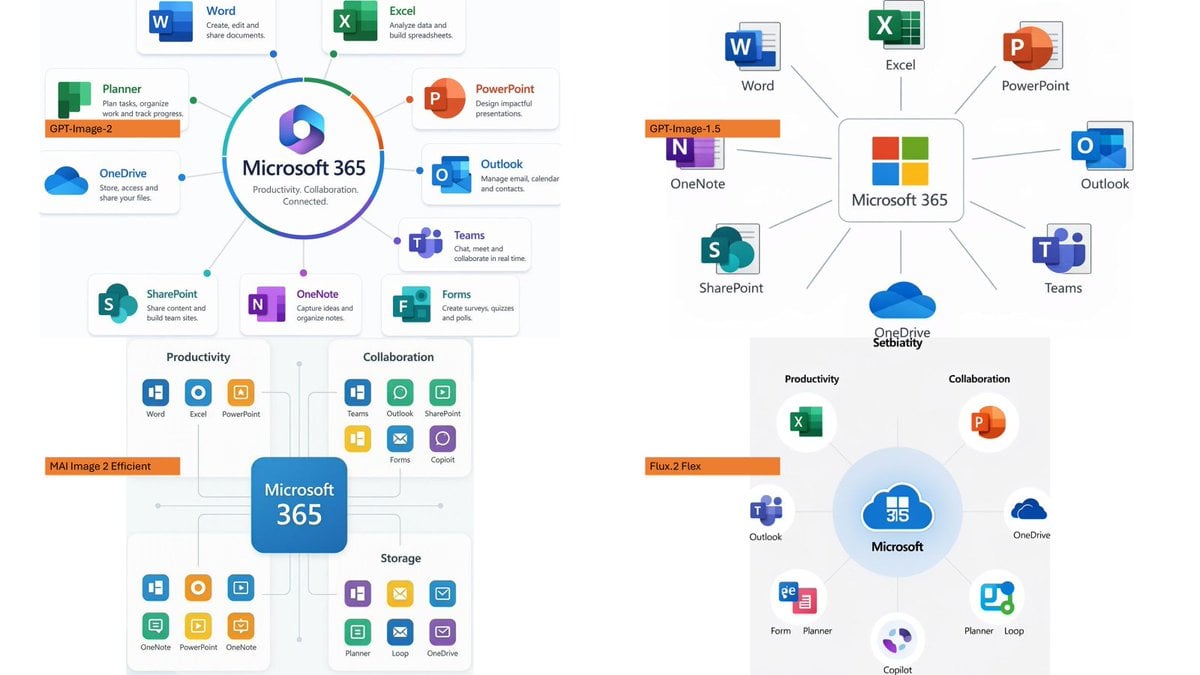
- Prompt included
- Model and format preset
- Free template
The prompt behind this image
Copy the exact prompt behind Microsoft 365 Model Comparison Infographic, or open it in the studio and make it yours.
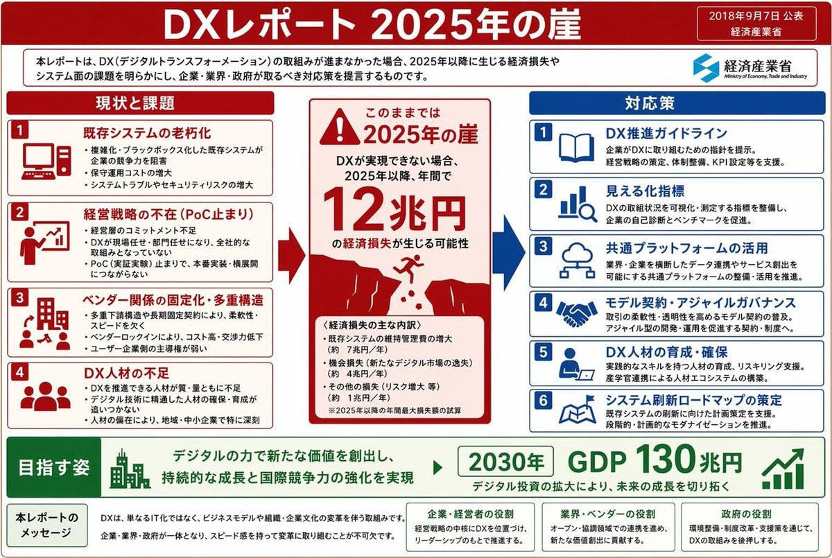
Using the provided reference image as a benchmark for a clean, readable business infographic style, create a 16:9 comparison slide that demonstrates how different image generation models render an infographic about {argument name="topic" default="Microsoft 365"}. Replace the Japanese DX report content with four separate sample infographic outputs arranged in a 2×2 grid on a white background. Layout: Use exactly 4 panels, each showing a different Microsoft 365 ecosystem diagram, with a small horizontal orange model label near the left side of that panel. The four labels must be: 1) {argument name="top left model label" default="GPT-Image-2"}, 2) {argument name="top right model label" default="GPT-Image-1.5"}, 3) {argument name="bottom left model label" default="MAI Image 2 Efficient"}, and 4) {argument name="bottom right model label" default="Flux.2 Flex"}. Panel content: Each panel should visualize Microsoft 365 at the center with surrounding app icons and labels. Include recognizable Microsoft-style app tiles/icons such as Word, Excel, PowerPoint, Outlook, Teams, OneDrive, SharePoint, OneNote, Forms, Planner, Loop, and Copilot where appropriate. Make the top-left panel the most polished and text-readable, with a circular hub-and-spoke diagram and concise app descriptions. Make the top-right panel simpler, with icons connected to a central Microsoft 365 box. Make the bottom-left panel look like a structured category chart with Productivity, Collaboration, and Storage sections. Make the bottom-right panel look like a softer radial diagram with category headings and some imperfect or slightly inconsistent labels to imply model comparison. Style: Clean corporate SaaS infographic aesthetic, lots of white space, thin gray connector lines, Microsoft-like blue/green/orange/purple icon colors, crisp readable English text. Preserve the reference image’s practical business-document feel, but do not recreate its Japanese government-report layout, red warning sections, arrows, or original text. Constraints: Show exactly four model comparison examples, no extra title banner, no watermark, no Japanese text, and keep all text legible enough to compare model performance.
Reference images included
Microsoft 365 Model Comparison Infographic needs input media to work. They load alongside the prompt when you open it in the studio.
How to use Microsoft 365 Model Comparison Infographic in 3 steps
- 1Upload ImagePNG, JPG or paste
Add your photo
Upload the photo the template builds on. The prompt, model and format are already set.
- 2…a portrait of your subject in softgolden-hour light, 85mm…
Personalize
Edit the subject and creative details for your destination.
- 3Generate
Generate
Press Generate — your image is created in PicX Studio, so you can compare it with the original and refine one variable at a time.
More like this
Templates with the same subject, style or setup. Open one to see its prompt.

AI Model Routing Comparison Infographic
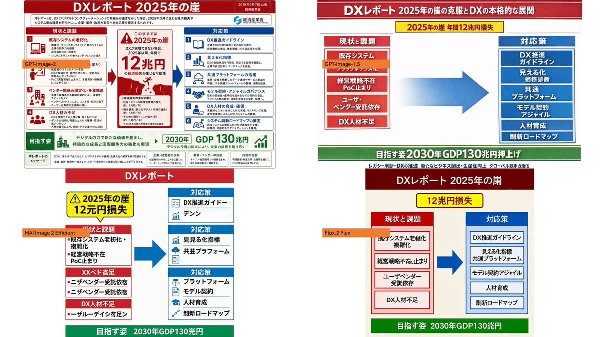
DX Infographic Model Comparison
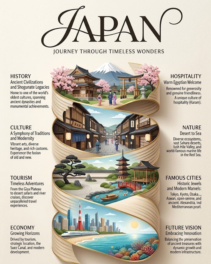
Japan Travel Brochure Poster
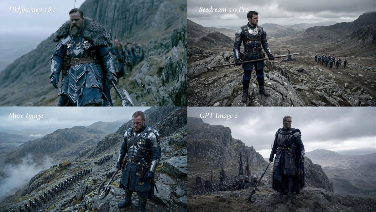
Fantasy Model Comparison Grid
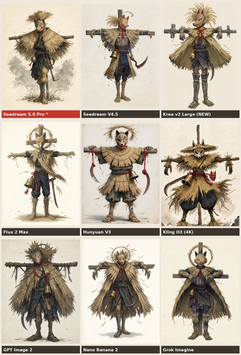
Nine-Model Scarecrow Yokai Comparison

Premium Vertical Product Campaign Poster

Isometric Process Educational Diorama
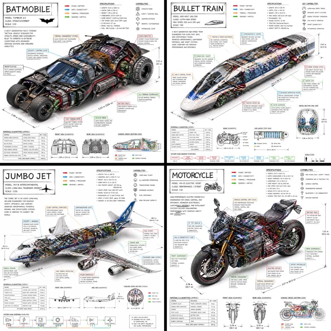
Isometric Vehicle Teardown Infographic Template

Calamari Cone Model Comparison
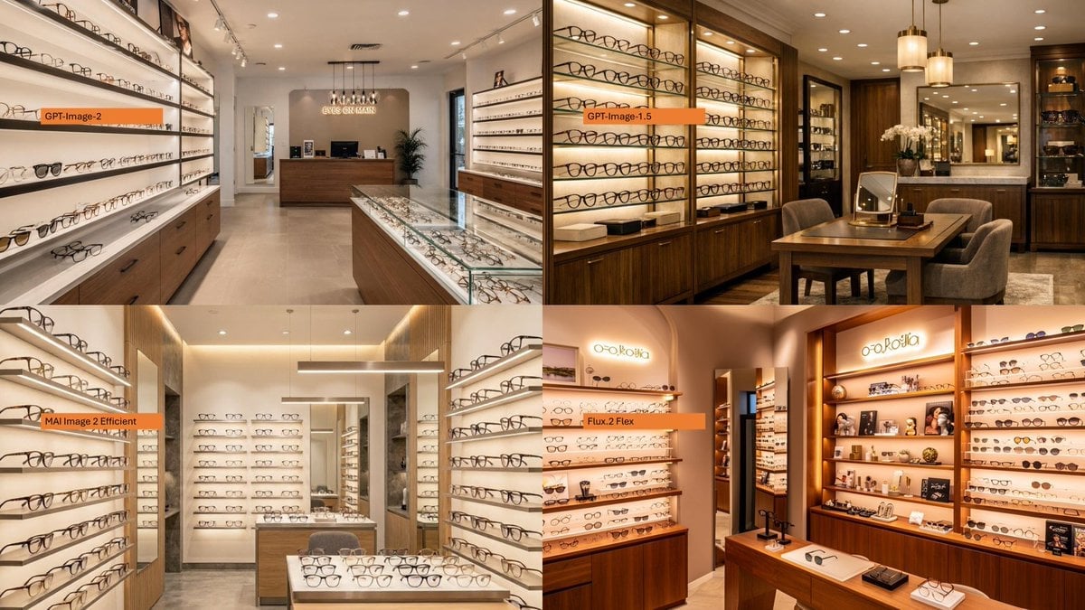
AI Model Eyewear Store Comparison
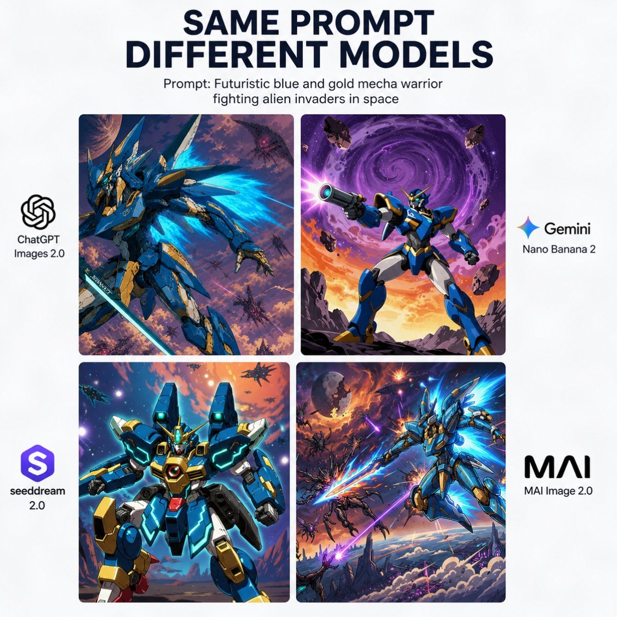
AI Model Mecha Comparison Poster
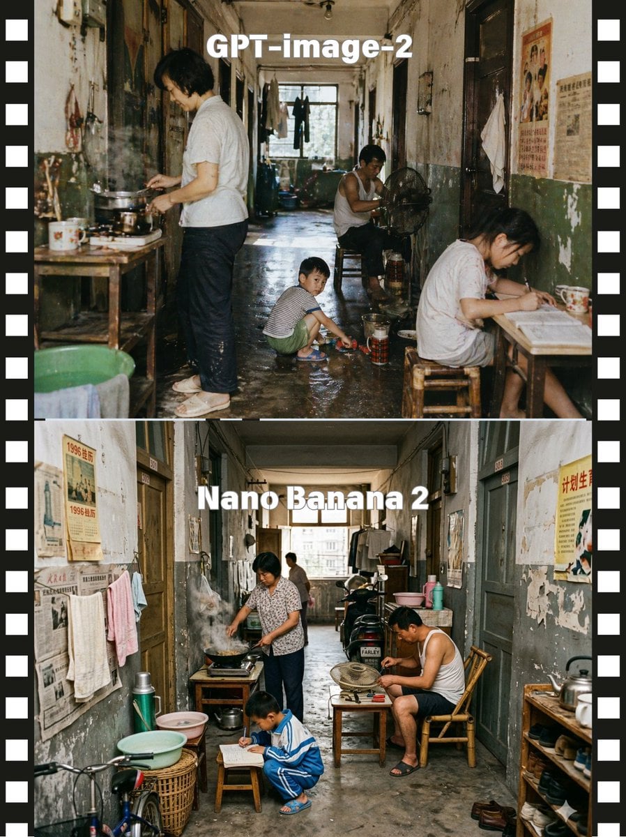
Stacked Corridor Model Comparison
Make it yours
Microsoft 365 Model Comparison Infographic works as-is. These are the safest ways to change it without losing the look.
Change one field
Copy a single group, rewrite it, and generate again so you can see what that field is doing.
Keep the frame, change the subject
Hold the composition and light of Microsoft 365 Model Comparison Infographic, then swap wardrobe, props or the person for a new take.
| If the result… | Why | Fix |
|---|---|---|
| The result drifts from the preview | Too many fields changed at once. | Reuse Microsoft 365 Model Comparison Infographic as-is first, then change one group — subject, light, or setting. |
| The model over-stylizes the scene | The prose prompt leaves finish and camera underspecified. | Add one camera or lighting sentence and stay on GPT Image 2. |
More GPT Image 2 templates
Other prompts made for GPT Image 2.

Six VTuber Japanese Logo Sheet

Realistic Portrait of Woman and Deer

The Vista Modular Condo Poster

2.5D Anime Art Board

Isometric Productivity Desk Scene

New York Double Exposure Poster
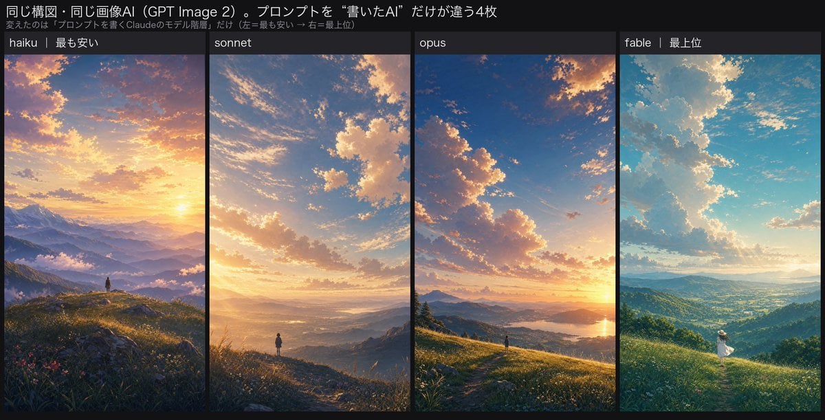
Four-Panel AI Landscape Comparison

Japanese Tatami Lifestyle Magazine Cover

NESCAFÉ Coffee Map Poster

Brutalist Cogito Chinese Typography Poster
More image prompts
Fresh picks from across the catalog.

Historical Macro Diorama: Culinary Atlas Grid

High-Fashion Ink Illustration Portrait

Dreamy Bubble with Handwritten Japanese Text

Spherical Character Meme Template

Ultra-realistic Indian Couple Cooking Portrait

Abstract Aqua Anime Poster

Flower-Framed Anime Cover Portrait

Low-Light Bedroom Selfie Prompt for Nano Banana/Gemini Pro

8K Cinematic Product Photography (Perfume)

Four Seasons Anime Girl Collage
Browse template categories
Microsoft 365 Model Comparison Infographic questions
How do I use the Microsoft 365 Model Comparison Infographic template?
Add your photo if the template asks for one, edit the prompt if you like — the template's model and format are already selected — and press Generate. Your version opens in PicX Studio.
Can I customize the Microsoft 365 Model Comparison Infographic template?
Yes. You can change the subject, setting, lighting, mood, format, and available model controls before creating your image.
Is the Microsoft 365 Model Comparison Infographic template free?
Opening and editing this template is free. Generating uses credits, shown on the Generate button when you are signed in.
Which AI model should I use?
Start with GPT Image 2, which is the model associated with this template. You can compare another compatible model for a different finish.
Looking for something else? Browse all templates.

Your photo, any look
Thousands of ready templates for every top image and video model, from one credit balance.